The Dashboard tool is used to assign dataviews to the current layout and apply default configuration settings.
This is the default tool that opens when entering design mode, and the current dashboard will be displayed by default.
The Edit group contains the following standard options.
|
|
Open |
Opens the Dashboards panel to load a different dashboard. |
|
|
Save |
Saves the current dashboard. |
|
|
New |
Opens the New Dashboard panel to create a new dashboard. |
|
|
Options |
Opens the Configuration panel to change the settings for the current dashboard. |
|
|
Export |
Opens a standard Save window to export the current dashboard to an XML file. Select a location, enter a filename, and click Save. |
|
|
Import |
Opens the Import Dashboard panel to import a dashboard file created with the Export option. |
The Dashboard group contains the following options.
|
|
Layout |
Opens the Select Layout panel to choose a different layout configuration for the dashboard. |
|
|
Insert |
Opens the Select DataView panel to add a dataview configuration to the dashboard. |
When the Dashboard window opens, the currently selected dashboard will open by default. Use the options in the Edit group to Open or Import an existing dashboard, or use New to create a new dashboard.
Proceed to the Dashboard Editing Screen section when the proper dashboard is displayed.
The Dashboards panel opens to the right of the screen when selecting Open from the Edit group. Click X to close the panel again.
The dashboards are displayed by
category. Each category can be expanded or collapsed using the  and
and  icons.
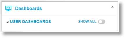
The User Dashboards category includes all dashboards that you have marked for Quick Access, currently or in the past.
Click Show All to display all available dashboards. This includes dashboards that you have created, dashboards that have been marked as available to everyone, and dashboards that you can access due to a security role.
Click the name of a dashboard to open it. Proceed to the Dashboard Editing Screen section.
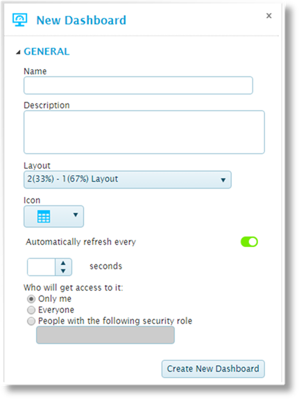
The New Dashboard panel opens to the right of the screen when selecting New from the Edit group. Click X to close the panel again.
|
Name |
Enter the name of the dashboard. |
|
Description |
Enter a description of the dashboard. |
|
Layout |
Select a layout configuration. Layouts can be created and customized in the Layout Design Tool section. |
|
Icon |
Select an icon to be displayed in the Quick Access group in analysis mode. |
|
Automatically refresh every |
When activated, the dashboard will refresh all data at intervals entered in the Seconds field. |
|
Who will get access to it |
Select if the dashboard is private or shared. This affects the ability to see and edit the dashboard in the Dashboard Design Tool, and the ability to see the dashboard in Analysis mode. |
|
•Only me |
Only you will be able to see this dashboard. |
|
•Everyone |
The dashboard will be visible to all users. |
|
•People with the following security role |
Only accessible to users with a specific security role assigned to their user account. Select this option and enter the Code of the required security role. |
Click Create New Dashboard to display the dashboard in the Dashboard Editing Screen. Note that the dashboard is not yet saved at this point.
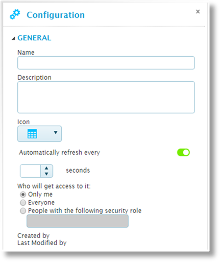
The Configuration panel opens to the right of the screen when selecting Options from the Edit group. Click X to close the panel again.
This panel is used to edit the configuration options for the current dashboard.
|
Name |
Enter the name of the dashboard. |
|
Description |
Enter a description of the dashboard. |
|
Icon |
Select an icon to be displayed in the Quick Access group in analysis mode. |
|
Automatically refresh every |
When activated, the dashboard will refresh all data at intervals entered in the Seconds field. |
|
Who will get access to it |
Select if the dashboard is private or shared. This affects the ability to see and edit the dashboard in the Dashboard Design Tool, and the ability to see the dashboard in Analysis mode. |
|
•Only me |
Only you will be able to see this dashboard. |
|
•Everyone |
The dashboard will be visible to all users. |
|
•People with the following security role |
Only accessible to users with a specific security role assigned to their user account. Select this option and enter the Code of the required security role. |
|
Created by |
Identifies the date and time the dashboard was created, and the user who created it. |
|
Last Modified by |
Identifies the last date and time the dashboard was changed, and the user who made the changes. |
The Import Dashboard panel opens to the right of the screen when selecting Import from the Edit group. Click X to close the panel again.
This panel is used to import a dashboard that has been exported to a file.
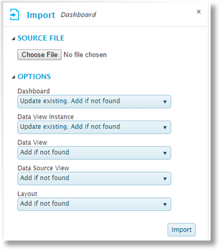
The Source File group is used to select the import file. Click the button to open a standard file browser window. Locate and select the appropriate export file. The file name appears next to the button.
The Options group controls how components will be imported. The following options are available:
|
− None |
This component will not be imported. |
|
− Add a new entity |
The import will be added as a new component, even if a component already exists with the same name. |
|
− Add if not found |
If a component exists with the same name, the import will not be performed. Otherwise, the import will be added as a new component. |
|
− Update existing. Add if not found |
If a component exists with the same name, it will be updated. Otherwise, the import will be added as a new component. |
|
− Update existing matching on Name |
If a component exists with the same name, it will be updated. Otherwise, the import will not be performed. |
The following components can be set for import.
|
Dashboard |
Select how the dashboard itself should be imported. |
|
Data View Instance |
The Data Views included in the dashboard can be imported along with the dashboard. Select how it should be imported. |
|
Data View |
The Data Views included in the dashboard can be imported along with the dashboard. Select how it should be imported. |
|
Data Source View |
The Data Sources included in the dashboard can be imported along with the dashboard. Select how it should be imported. |
|
Layout |
The Layout used for the dashboard can be imported along with the dashboard. Select how it should be imported. |
Click Import to import the file.
|
|
Notes: If one of the Update Existing options are selected and more than one matching layout is found, the first matching layout will be updated. |
|
If one of the Update Existing options are selected, the saved layout is updated. If that layout is currently open in the Layout Editor, it will not show any changes immediately. Re-open the saved layout to see the imported changes. If the layout is saved before the imported changes are re-loaded, it will overwrite the imported changes. |
The Select Layout panel opens to the right of the screen when selecting Layout from the Dashboard group. Click X to close the panel again.
This panel is used to apply a different saved layout to the current dashboard.

Each layout name is followed by the percentage size of the dashboard, as configured in the layout design. A preview of the tile division is displayed below the name.
Click a name to select and apply the new layout. Any dataviews already assigned to the dashboard will be re-assigned to the tiles with the same cell number as in the previous layout. If no matching cell exists in the new layout, the dataview will be placed in the tray section at the bottom of the dashboard.
Note that the changes are not saved until the dashboard is saved.
The Select DataView panel
opens to the right of the screen when selecting Insert from the
Dashboard group or clicking the add icon  in a tile or the tray section.
Click X to close the panel again.
in a tile or the tray section.
Click X to close the panel again.
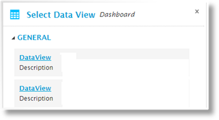
Click a name to add the dataview. If adding from a tile, the dataview is added to that tile. If adding from the tray section or the Insert option, the dataview is added to the tray section, but can then be moved to a tile.
The addition of the dataview is automatically saved, although no other changes to the dashboard are saved.
The main screen of the Dashboard tool shows the current tile layout and the dataview assignments.
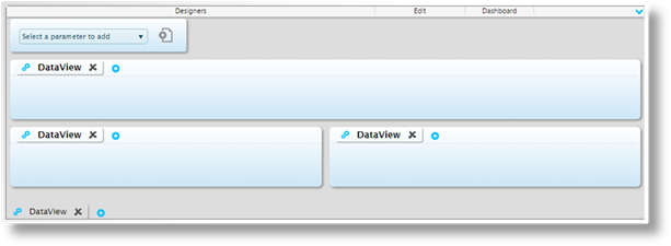
The screen is composed of three sections.
The parameter control feature is not functional at this time.
The main area of the dashboard
displays the tiles as configured in the selected layout. Each tile
includes an add icon which opens the Select
DataView panel.
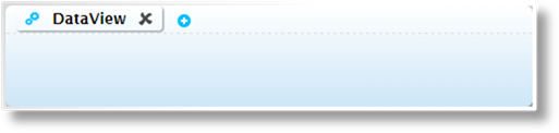
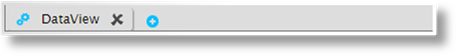
When a dataview is assigned to a
tile, it appears as a tab in the tile header, and is labeled with its default
title. The delete icon  removes the dataview. The
configuration icon
removes the dataview. The
configuration icon  opens
the Configuration
panel to manage default settings for the dataview. Clicking the title
itself shows or hides a sample of the data, which can be used to preview changes
to the settings.
opens
the Configuration
panel to manage default settings for the dataview. Clicking the title
itself shows or hides a sample of the data, which can be used to preview changes
to the settings.
Dataview tabs can be rearranged by dragging them between tiles and the tray section.
At the bottom of the dashboard is
the tray section. This contains additional dataviews that are kept
collapsed by default. Clicking one of these dataviews in analysis mode
expands it to full-screen view, and the Collapse icon  returns it to the tray. This
section is useful for providing additional information that does not need to be
displayed in the main dashboard view.
returns it to the tray. This
section is useful for providing additional information that does not need to be
displayed in the main dashboard view.
The Configuration
panel opens to the right of the screen when clicking the configuration
icon from a data view,
and contains settings for the current view. Click X to close the
panel again.
These settings become the default configuration for the dataview, although many of these options can be overridden by each user in analysis mode.
The options are displayed by
category. Each category can be expanded or collapsed using the and icons.
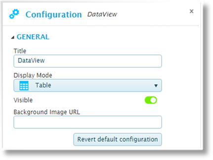
The General category includes the following options.
|
Title |
Enter the title of the data view to be displayed at the top of the tile. |
|
Display Mode |
Select the format. |
|
Visible |
If enabled, the dataview will be visible at all times. If disabled, the dataview will be hidden when the dashboard loads. If another dataview is linked to the current dataview, activating that link will reveal and refresh the current dataview. |
|
Background Image URL |
This feature is not functional at this time. |
Click Revert default configuration to reset the data view to its original configuration. This deletes any custom configuration saved for the view.
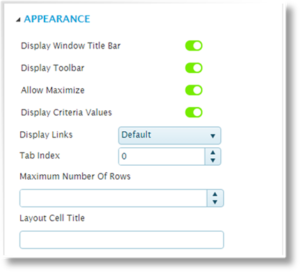
The Appearance category includes the following options.
|
Display Window Title Bar |
If enabled, the title bar will be displayed at the top of the tile. If disabled, the titles of all dataviews within the tile will be hidden, as well as the Control icon. Note that hiding the title bar will prevent access to this settings page in analysis mode. |
|
Display Toolbar |
If enabled, the Control icon will be displayed to the left of the dataview name, providing access to the configuration options for that data view. If disabled, the Control icon will not be displayed. Note that hiding the control icon will prevent access to this settings page in analysis mode. |
|
Allow Maximize |
If enabled, the Expand icon will be displayed at the right of the title bar, allowing the tile to be expanded to fill the dashboard. If disabled, the Expand icon will not be displayed. |
|
Display Criteria Values |
If enabled, the Criteria icon |
|
Display Links |
This feature is currently inactive. |
|
Tab Index |
When multiple dataviews are included in a tile, the Tab Index controls the order in which they will be displayed. Enter the number for the current dataview. |
|
Maximum Number Of Rows |
Enter the maximum number of rows to be displayed. The See All icon becomes available in the top right of the tile, which will show all rows. |
|
Layout Cell Title |
This feature is currently inactive. |
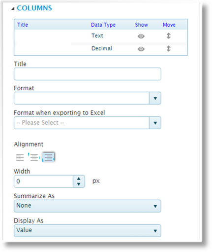
The Columns category controls the configuration of each data element in the view.
The top table is used to select
each element by Title, displaying the configuration
settings for each. The Data Type column identifies the type of
data. Click the Show icons to set whether the
column is shown  or
hidden
or
hidden  . Click and drag
the Move icon
. Click and drag
the Move icon  to change the order of the
columns.
to change the order of the
columns.
|
Title |
Enter the name of the data element. This will serve as the column name for tables, label for card layout, or legend entry for line, bar, column, or pie charts. |
|
Format |
Select a custom format for the data. |
|
Format when exporting to Excel |
Select a custom format for when the data is exported. This uses the Excel formatting rules, which may not match the display Format defined above. |
|
Alignment |
Select if the data should be aligned to the left, centered, or the right. |
|
Width |
Enter the column width, in pixels. Enter zero to return to the default width. |
|
Summarize As |
Select what value will be displayed in the Total line. |
|
•None |
No summary value will be displayed. |
|
•Average |
Displays an average of all rows. |
|
•Average of non empty |
Displays an average of all rows that include a value. Rows without a value in this column are omitted from the average. |
|
•Average of non zero |
Instructions to be completed. |
|
•Count |
Displays the total number of rows. |
|
•Count of non empty |
Displays the total number of rows that include a value. Rows without a value in this column are not counted. |
|
•Count of non zero |
Instructions to be completed. |
|
•Maximum |
Displays the highest value in the column. |
|
•Minimum |
Displays the lowest value in the column, including zero or no value. |
|
•Minimum of non empty |
Displays the lowest value in the column, including zero. |
|
•Minimum of non zero |
Instructions to be completed. |
|
•Sum |
Displays the total of all values in the column. |
|
Display As |
This option is available for numeric values. |
|
•Value |
Displays the straight value. |
|
•Running total |
Displays a total of the current value plus all preceding values in the column. |
|
•Group running total |
Instructions to be completed. |
|
•Percent to total |
Displays the current value as a percentage of the total value for the column. |
|
•Percent to group |
Instructions to be completed. |
The Options category includes settings grouped into tabs.
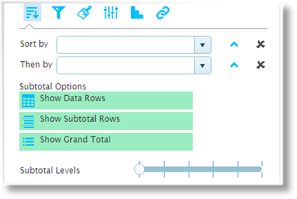
The Sorting & Sub-Totals
tab  includes the
following options.
includes the
following options.
|
Sort by |
Select the first sorted column. Click the arrows
to sort in ascending |
|
Then by |
Select all additional columns to sort by, in
order. Click the arrows to sort in ascending |
|
Subtotal Options |
Click one or more options for displaying totals and subtotals. |
|
•Show Data Rows |
Select this option to include the individual data rows. Without this option, only the selected total and subtotal lines will be displayed. |
|
•Show Subtotal Rows |
Displays a subtotal row for each unique entry in the selected Sort by column. |
|
•Show Grand Total |
Displays a grand total row at the bottom of the table. |
|
Subtotal Levels |
Instructions to be completed. |

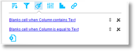
The Filtering tab  lists all current filter
rules.
lists all current filter
rules.
The title provides a summary of the
filter conditions. Click and drag the Move icon to change the order of the
rules. Click  to
delete the rule.
to
delete the rule.
Click the title to view an existing
filter rule, or click the Add new rule icon  to create a new rule. See the Managing Filter
Rules section for details.
to create a new rule. See the Managing Filter
Rules section for details.
The Conditional Formatting
tab  allows special
formatting rules to be applied when certain conditions are met.
allows special
formatting rules to be applied when certain conditions are met.
The title provides a summary of the
formatting conditions. Click and drag the Move icon to change the order of the
rules. Click to
delete the rule.
Click the title to view an existing
formatting rule, or click the Add new rule icon to create a new rule. See the Managing
Conditional Formatting Rules section for details.
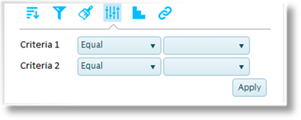
Base criteria can be applied to a
dataview at the configuration level. Criteria rules are high-level
conditions that restrict the data being brought into the dataview. The
Criteria tab  displays the current criteria, and
allows them to be adjusted or deactivated for the current user.
displays the current criteria, and
allows them to be adjusted or deactivated for the current user.
|
Source Value |
Displays the name of the data element. This data may not be included in the dataview itself. |
|
Comparison |
Select how the data will be evaluated. |
|
•Before |
The Source Value is less than the Comparison Value. |
|
•Before or equal |
The Source Value is less than or equal to the Comparison Value. |
|
•Equal |
The Source Value is equal to the Comparison Value. |
|
•Not equal |
The Source Value is not equal to the Comparison Value. |
|
•After |
The Source Value is greater than the Comparison Value. |
|
•After or equal |
The Source Value is greater than or equal to the Comparison Value. |
|
•Is empty |
The Source Value is blank. No Comparison Value is required for this option. |
|
•Is not empty |
The Source Value contains any value at all. No Comparison Value is required for this option. |
|
•Starts with |
The Source Value begins with the full Comparison Value. |
|
•Does not start with |
The Source Value does not begin with the full Comparison Value. |
|
•Ends with |
The Source Value ends with the full Comparison Value. |
|
•Does not end with |
The Source Value does not end with the full Comparison Value. |
|
•Contains |
The Source Value includes the full Comparison Value anywhere within the data. |
|
•Does not contain |
The Source Value does not include the full Comparison Value anywhere within the data. |
|
•Between |
The Source Value falls between the two Comparison Values. |
|
•Not between |
The Source Value does not fall between the two Comparison Values. |
|
•In list |
The Source Value matches at least one entry in the Comparison Values. |
|
•Not in list |
The Source Value does not match any entry in the Comparison Values. |
|
Comparison Values |
If one or more
Comparison Values are required, enter the values in the
fields. For a list of values, click the Add new list item
icon |
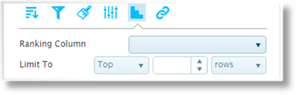
The Ranking tab  allows one column in the
dataview to be set for ranking.
allows one column in the
dataview to be set for ranking.
|
Ranking Column |
Select the column to be used for ranking. |
|
Limit To |
The ranking can limit the number of results displayed in the dataview. Select if the Top values or Bottom values should be displayed, enter the value, and select if it should be based on the value of the Rows or the Percentage. |
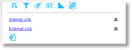
The Links tab  allows columns or entire
rows to affect other dataviews, navigate to other dashboards, or open external
websites.
allows columns or entire
rows to affect other dataviews, navigate to other dashboards, or open external
websites.
Click the title to view an existing
link configuration, or click the Add new link icon to create a new link. Click to delete the link. See
the Managing Link
Configurations section for details.
Filters can be applied to focus the data within a selected view. The filters can be simple conditions or advanced logical structures, which will be evaluated for each row in the table.
1.
Open the Control panel  for the selected view, and click the
Options button
for the selected view, and click the
Options button  to open the Configuration
panel.
to open the Configuration
panel.
2.
Expand the Options category, and select the Filtering
tab .
3.
The title provides a summary of the filter conditions. Click and drag the
Move icon to
change the order of the rules. Click to delete the rule.
4.
Click the title to view an existing filter rule, or click the Add new
rule icon to
create a new rule. The Rule Editor window opens.
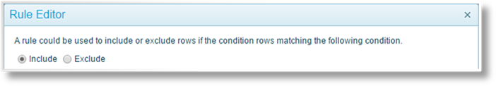
Select if the rule should Include or Exclude data when the Condition evaluates as true.

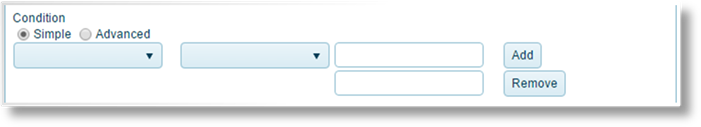
The rule can contain Simple or Advanced conditions. For Simple conditions, the following settings are available.
|
Source Value |
Select the column containing the data to be evaluated. |
|
Comparison |
Select how the data will be evaluated. |
|
•Before |
The Source Value is less than the Comparison Value. |
|
•Before or equal |
The Source Value is less than or equal to the Comparison Value. |
|
•Equal |
The Source Value is equal to the Comparison Value. |
|
•Not equal |
The Source Value is not equal to the Comparison Value. |
|
•After |
The Source Value is greater than the Comparison Value. |
|
•After or equal |
The Source Value is greater than or equal to the Comparison Value. |
|
•Is empty |
The Source Value is blank. No Comparison Value is required for this option. |
|
•Is not empty |
The Source Value contains any value at all. No Comparison Value is required for this option. |
|
•Starts with |
The Source Value begins with the full Comparison Value. |
|
•Does not start with |
The Source Value does not begin with the full Comparison Value. |
|
•Ends with |
The Source Value ends with the full Comparison Value. |
|
•Does not end with |
The Source Value does not end with the full Comparison Value. |
|
•Contains |
The Source Value includes the full Comparison Value anywhere within the data. |
|
•Does not contain |
The Source Value does not include the full Comparison Value anywhere within the data. |
|
•Between |
The Source Value falls between the two Comparison Values. |
|
•Not between |
The Source Value does not fall between the two Comparison Values. |
|
•In list |
The Source Value matches at least one entry in the Comparison Values. |
|
•Not in list |
The Source Value does not match any entry in the Comparison Values. |
|
Comparison Values |
If one or more Comparison Values are required, enter the values in the fields. For a list of values, click the Add button to add additional fields, or click Remove to remove a field. |

For Advanced conditions, a formula can be entered manually, assembled from options provided below, or any combination of the two. Pointing to an option displays a description in the yellow field at the bottom of the window.
|
Formula Field |
The condition formula is assembled in this field. Selecting any option from the lists inserts that option at the current cursor position. Text and values can also be typed in manually. |
|
Fields |
Inserts placeholders that retrieve data from the current data view. |
|
•Columns |
Provides the columns from the current data view. |
|
•Aggregates |
Provides options for all data within a selected column. Once an aggregate is inserted, a Column must be specified within the parentheses. |
|
Functions |
Inserts functions for calculations, logical structures, and retrieving data from the system. |
|
•General |
Provides options such as comparisons and using system triggers. |
|
•Math & Stat |
Provides mathematical options. |
|
•Date & Time |
Provides options to retrieve and manipulate dates and times. |
|
Operators |
Inserts operators to structure the formula. |
|
•General / Numeric |
Provides the standard mathematical symbols. |
|
•Logical |
Provides options and characters for comparisons and structuring the formula. |
|
•Data Type |
Used to verify what type of data is provided. |
|
•Text |
Used to combine values. |
5. Click OK to save the rule and close the window, or click Cancel to close the window without saving the rule.
Custom formatting can be applied to highlight data within a selected view. The formatting rules can be simple conditions or advanced logical structures, which will be evaluated for each row in the table.
1.
Open the Control panel for the selected view, and click the
Options button to open the Configuration
panel.
2.
Expand the Options category, and select the Conditional Formatting
tab .
3.
The title provides a summary of the rule conditions. Click and drag the
Move icon to
change the order of the rules. Click to delete the rule.
4.
Click the title to view an existing formatting rule, or click the Add new
rule icon to
create a new rule. The Rule Editor window opens.
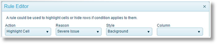
Define the formatting that should be applied when the Condition evaluates as true.
|
Action |
Select how the formatting will be applied. |
|
•Highlight Cell |
The cell in the selected Column will be highlighted. |
|
•Highlight Row |
The entire row will be highlighted. |
|
•Blank Value |
The cell in the selected Column will be blank. |
|
Reason |
The highlight color is set by the selected Reason. This field is available when Action is set to Highlight Cell or Highlight Row. |
|
•Severe Issue |
|
|
•Issue |
|
|
•Severe Warning |
|
|
•Warning |
|
|
•Good |
|
|
•Very Good |
|
|
•Excellent |
|
|
•Very Excellent |
|
|
Style |
Select the appearance of the highlight. This field is available when Action is set to Highlight Cell or Highlight Row. |
|
•Background |
|
|
•Box |
|
|
•Circle |
|
|
•Disk |
|
|
Column |
Select the column to be highlighted or blanked. This field is available when Action is set to Highlight Cell or Blank Value. |
The rule can contain Simple or Advanced conditions. For Simple conditions, the following settings are available.
|
Source Value |
Select the column containing the data to be evaluated. When the Action field is set to Highlight Cell or Blank Value, this field will be automatically set to the Column selected in the format settings. |
|
Comparison |
Select how the data will be evaluated. |
|
•Before |
The Source Value is less than the Comparison Value. |
|
•Before or equal |
The Source Value is less than or equal to the Comparison Value. |
|
•Equal |
The Source Value is equal to the Comparison Value. |
|
•Not equal |
The Source Value is not equal to the Comparison Value. |
|
•After |
The Source Value is greater than the Comparison Value. |
|
•After or equal |
The Source Value is greater than or equal to the Comparison Value. |
|
•Is empty |
The Source Value is blank. No Comparison Value is required for this option. |
|
•Is not empty |
The Source Value contains any value at all. No Comparison Value is required for this option. |
|
•Starts with |
The Source Value begins with the full Comparison Value. |
|
•Does not start with |
The Source Value does not begin with the full Comparison Value. |
|
•Ends with |
The Source Value ends with the full Comparison Value. |
|
•Does not end with |
The Source Value does not end with the full Comparison Value. |
|
•Contains |
The Source Value includes the full Comparison Value anywhere within the data. |
|
•Does not contain |
The Source Value does not include the full Comparison Value anywhere within the data. |
|
•Between |
The Source Value falls between the two Comparison Values. |
|
•Not between |
The Source Value does not fall between the two Comparison Values. |
|
•In list |
The Source Value matches at least one entry in the Comparison Values. |
|
•Not in list |
The Source Value does not match any entry in the Comparison Values. |
|
Comparison Values |
If one or more Comparison Values are required, enter the values in the fields. For a list of values, click the Add button to add additional fields, or click Remove to remove a field. |
For Advanced conditions, a formula can be entered manually, assembled from options provided below, or any combination of the two. Pointing to an option displays a description in the yellow field at the bottom of the window.
|
Formula Field |
The condition formula is assembled in this field. Selecting any option from the lists inserts that option at the current cursor position. Text and values can also be typed in manually. |
|
Fields |
Inserts placeholders that retrieve data from the current data view. |
|
•Columns |
Provides the columns from the current data view. |
|
•Aggregates |
Provides options for all data within a selected column. Once an aggregate is inserted, a Column must be specified within the parentheses. |
|
Functions |
Inserts functions for calculations, logical structures, and retrieving data from the system. |
|
•General |
Provides options such as comparisons and using system triggers. |
|
•Math & Stat |
Provides mathematical options. |
|
•Date & Time |
Provides options to retrieve and manipulate dates and times. |
|
Operators |
Inserts operators to structure the formula. |
|
•General / Numeric |
Provides the standard mathematical symbols. |
|
•Logical |
Provides options and characters for comparisons and structuring the formula. |
|
•Data Type |
Used to verify what type of data is provided. |
|
•Text |
Used to combine values. |
5. Click OK to save the rule and close the window, or click Cancel to close the window without saving the rule.
Links can be configured so that when a user clicks on a specific column, or an entire row, a specific action occurs. This may refresh another dataview in the dashboard, possibly filtering that dataview to focus on data related to the selection, or it could navigate to another dashboard or open an external website.
1.
Open the Configuration panel for the appropriate dataview.
2.
Expand the Options category, and select the Links tab .
3.
The links are listed by name. Click to delete a link configuration.
4.
Click the name to view an existing link configuration, or click the Add new
link icon to create
a new link. The Link Editor window opens.
5. Enter the necessary settings.
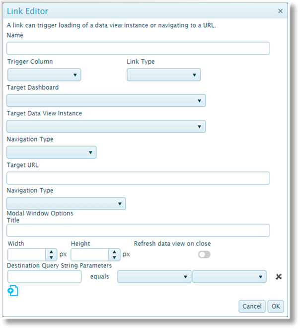
|
Name |
Enter the name of the link. |
|
Trigger Column |
Select a column to only activate the link when the user clicks on that column, or select Entire Row to activate the link when the user clicks anywhere in the row. |
|
Link Type |
Select what type of link this should be. The selection will control the other available settings. |
|
•Dashboard |
The link will navigate to another dashboard. The user can return to the previous dashboard using the Back button in the toolbar panel. |
|
•DataView |
The link will refresh another dataview in the current dashboard, revealing that dataview if it is currently hidden. Criteria can be configured for the target dataview to filter the content based on the data selected in the source dataview. |
|
•URL |
Opens an external page by URL. |
|
Target Dashboard |
This field is available when Dashboard is selected as the Link Type. Select the dashboard to open on clicking the link. |
|
Target DataView Instance |
This field is available when DataView is selected as the Link Type. Select another dataview in the dashboard. Dataviews in the tray section are not available for links. |
|
Navigation Type |
This field is available when DataView is selected as the Link Type. |
|
Target URL |
This field is available when URL is selected as the Link Type. Enter the URL of the target web page. |
|
Navigation Type |
This field is available when URL is selected as the Link Type. Select how the URL should be handled. |
|
•Modal Popup |
The URL opens in a window within the current page. Additional settings become available for this option. |
|
•New Window |
The URL opens in a new browser tab or window, depending on the browser settings. |
|
•Current Window |
The current window navigates directly to the URL, leaving the dashboard. |
|
Title |
This field is available when Modal Popup is selected as the Navigation Type. Enter the title to be displayed at the top of the window. |
|
Width / Height |
These fields are available when Modal Popup is selected as the Navigation Type. Enter the dimensions of the window, in pixels. |
|
Refresh dataview on close |
This option is available when Modal Popup is selected as the Navigation Type. When enabled, the dataview that opened the window will refresh when the window is closed. This should be used when the external page is used to modify the source data of the dataview. When disabled, the dataview will not refresh until another event triggers a refresh. |
The Destination Query String Parameters section is available when URL is selected as the Link Type. If the target URL can accept input or query values, they can be configured here.
Click the Add
new icon to add a
new parameter line, or click the delete icon  to remove an existing parameter
line.
to remove an existing parameter
line.
Enter the parameter code, then select the data to be provided for the URL.
|
Not Used |
Select this option if the parameter code does not require additional information. |
|
Column |
Adds a field to select a column from the dataview. |
|
Constant |
Adds a field to enter a constant value. |
|
Distribution |
Adds a field to select whether the Range maximum or Range minimum values will be provided. |
|
Parameter |
Instructions to be completed. |
|
Dashboard Parameter |
Instructions to be completed. |
|
Query string |
Adds a field to enter a specific query. |
|
Token |
Instructions to be completed. |
|
System Value |
Adds a field to select a system value. |
|
•None |
Provides no information. |
|
•User ID |
Provides the ID of the current user. |
|
•User Name |
Provides the full first and last names of the user. |
|
•Login ID |
Instructions to be completed. |
|
•Host App User ID |
Instructions to be completed. |
6. Click OK to save the link configuration and close the window, or click Cancel to close the window without saving the link.


 will be displayed in the top
right of the tile whenever there are criteria rules applied to the current
data view. The user can click the icon to view the criteria.
If disabled, the icon will not be shown.
will be displayed in the top
right of the tile whenever there are criteria rules applied to the current
data view. The user can click the icon to view the criteria.
If disabled, the icon will not be shown. or descending
  order. Click
  or descending
  to add
additional fields, or click the Delete icon
to add
additional fields, or click the Delete icon  to remove a
field.
to remove a
field.