in the top-right of each
tile expands the tile to fill the dashboard area. The Collapse
icon
in the top-right of each
tile expands the tile to fill the dashboard area. The Collapse
icon  returns the
tile to its original size. This option may be disabled in the
configuration.
returns the
tile to its original size. This option may be disabled in the
configuration.Each tile within the dashboard has one or more DataViews, and each view has its own options and settings.
The Expand icon in the top-right of each
tile expands the tile to fill the dashboard area. The Collapse
icon returns the
tile to its original size. This option may be disabled in the
configuration.
The Notes icon  may be displayed in the
top-right of the tile, indicating that there are unread notes attached to at
least one of the views within the tile.
may be displayed in the
top-right of the tile, indicating that there are unread notes attached to at
least one of the views within the tile.
The Criteria icon  in the top-right of the tile
indicates that there are currently one or more criteria rules limiting the
content of the current dataview. Click the icon to view the applied
criteria. This option may be disabled in the configuration.
in the top-right of the tile
indicates that there are currently one or more criteria rules limiting the
content of the current dataview. Click the icon to view the applied
criteria. This option may be disabled in the configuration.
If a tile contains multiple dataviews, they will be listed along the top of the tile. Click the name of the dataview to switch to that view.
The Control icon  to the left of each dataview
tab opens the control panel for that specific view.
to the left of each dataview
tab opens the control panel for that specific view.
|
|
Refresh |
Reloads the current view without affecting the other views. |
|
|
Save |
Saves the settings for the current view. |
|
|
Options |
Opens the Configuration panel to change the settings for the current view. |
|
|
Table |
Changes the view to a table format, with all data displayed in a grid. |
|
|
Card |
Changes the view to a card format, with the window
displaying one entry at a time. Navigation controls in the
bottom-right |
|
|
Line |
Changes the view to a line chart format. |
|
|
Bar |
Changes the view to a bar chart format. |
|
|
Column |
Changes the view to a column chart format. |
|
|
Pie |
Changes the view to a pie chart format. |
|
|
Notes |
Opens the Notes panel to add notes related to the current view. |
|
|
Snapshot |
This feature is currently inactive. |
|
|
Schedule |
This feature is currently inactive. |
|
|
Excel |
Opens the content of the current view in an Excel file. This is only available for Table layouts. |
|
|
|
Opens the Export Options panel to save the current view as a PDF file. |
The Configuration panel opens to the right of the screen when selecting Options from a data view, and contains settings for the current view. Click X to close the panel again.
The options are displayed by
category. Each category can be expanded or collapsed using the  and
and  icons.
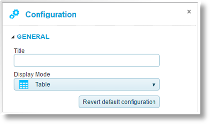
The General category includes the following options.
|
Title |
Enter the title of the data view to be displayed at the top of the tile. |
|
Display Mode |
Select the format. |
Click Revert default configuration to reset the data view to its original configuration. This deletes any custom configuration saved for the view.

The Appearance category includes the following options.
|
Display Window Title Bar |
If enabled, the title bar will be displayed at the top of the tile. If disabled, the titles of all DataViews within the tile will be hidden, as well as the Control icon. Note that hiding the title bar will prevent access to this settings page, and can only be recovered by an administrative user. |
|
Display Toolbar |
If enabled, the Control icon will be displayed to the left of the DataView name, providing access to the configuration options for that data view. If disabled, the Control icon will not be displayed. Note that hiding the control icon will prevent access to this settings page, and can only be recovered by an administrative user. |
|
Allow Maximize |
If enabled, the Expand icon will be displayed at the right of the title bar, allowing the tile to be expanded to fill the dashboard. If disabled, the Expand icon will not be displayed. |
|
Display Criteria Values |
If enabled, the Criteria icon |
|
Display Links |
This feature is currently inactive. |
|
Tab Index |
When multiple dataviews are included in a tile, the Tab Index controls the order in which they will be displayed. Enter the number for the current dataview. |
|
Maximum Number Of Rows |
Enter the maximum number of rows to be displayed. The See All icon becomes available in the top right of the tile, which will show all rows. |
|
Layout Cell Title |
This feature is currently inactive. |
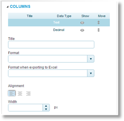
The Columns category controls the configuration of each data element in the view.
The top table is used to select
each element by Title, displaying the configuration
settings for each. The Data Type column identifies the type of
data. Click the Show icons to set whether the
column is shown  or
hidden
or
hidden  . Click and drag
the Move icon
. Click and drag
the Move icon  to change the order of the
columns.
to change the order of the
columns.
|
Title |
Enter the name of the data element. This will serve as the column name for tables, label for card layout, or legend entry for line, bar, column, or pie charts. |
|
Format |
Select a custom format for the data. |
|
Format when exporting to Excel |
Select a custom format for when the data is exported. This uses the Excel formatting rules, which may not match the display Format defined above. |
|
Alignment |
Select if the data should be aligned to the left, centered, or the right. |
|
Width |
Enter the column width, in pixels. Enter zero to return to the default width. |
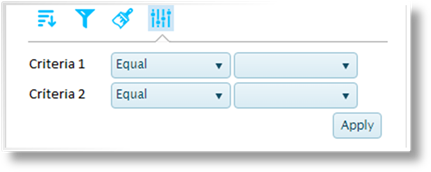
The Options category includes settings grouped into tabs.
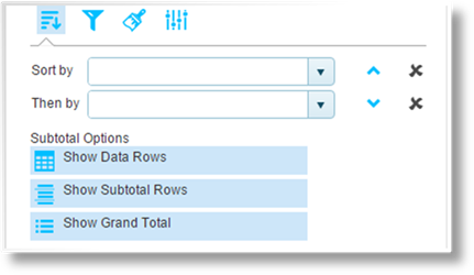
The Sorting & Sub-Totals
tab  includes the
following options.
includes the
following options.
|
Sort by |
Select the first sorted column. Click the arrows
to sort in ascending |
|
Then by |
Select all additional columns to sort by, in
order. Click the arrows to sort in ascending |
|
Subtotal Options |
Click one or more options for displaying totals and subtotals. |
|
•Show Data Rows |
Select this option to include the individual data rows. Without this option, only the selected total and subtotal lines will be displayed. |
|
•Show Subtotal Rows |
Displays a subtotal row for each unique entry in the selected Sort by column. |
|
•Show Grand Total |
Displays a grand total row at the bottom of the table. |
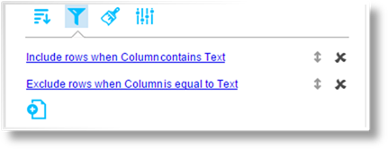
The Filtering tab  lists all current filter
rules.
lists all current filter
rules.
The title provides a summary of the
filter conditions. Click and drag the Move icon to change the order of the
rules. Click  to
delete the rule.
to
delete the rule.
Click the title to view an existing
filter rule, or click the Add new rule icon  to create a new rule. See the Managing Filter
Rules section for details.
to create a new rule. See the Managing Filter
Rules section for details.

The Conditional Formatting
tab  allows special
formatting rules to be applied when certain conditions are met.
allows special
formatting rules to be applied when certain conditions are met.
The title provides a summary of the
formatting conditions. Click and drag the Move icon to change the order of the
rules. Click to
delete the rule.
Click the title to view an existing
formatting rule, or click the Add new rule icon to create a new rule. See the Managing
Conditional Formatting Rules section for details.
Base criteria can be applied to a
dataview at the configuration level. Criteria rules are high-level
conditions that restrict the data being brought into the dataview. The
Criteria tab  displays the current criteria, and
allows them to be adjusted or deactivated for the current user.
displays the current criteria, and
allows them to be adjusted or deactivated for the current user.
|
Source Value |
Displays the name of the data element. This data may not be included in the dataview itself. |
|
Comparison |
Select how the data will be evaluated. |
|
•Before |
The Source Value is less than the Comparison Value. |
|
•Before or equal |
The Source Value is less than or equal to the Comparison Value. |
|
•Equal |
The Source Value is equal to the Comparison Value. |
|
•Not equal |
The Source Value is not equal to the Comparison Value. |
|
•After |
The Source Value is greater than the Comparison Value. |
|
•After or equal |
The Source Value is greater than or equal to the Comparison Value. |
|
•Is empty |
The Source Value is blank. No Comparison Value is required for this option. |
|
•Is not empty |
The Source Value contains any value at all. No Comparison Value is required for this option. |
|
•Starts with |
The Source Value begins with the full Comparison Value. |
|
•Does not start with |
The Source Value does not begin with the full Comparison Value. |
|
•Ends with |
The Source Value ends with the full Comparison Value. |
|
•Does not end with |
The Source Value does not end with the full Comparison Value. |
|
•Contains |
The Source Value includes the full Comparison Value anywhere within the data. |
|
•Does not contain |
The Source Value does not include the full Comparison Value anywhere within the data. |
|
•Between |
The Source Value falls between the two Comparison Values. |
|
•Not between |
The Source Value does not fall between the two Comparison Values. |
|
•In list |
The Source Value matches at least one entry in the Comparison Values. |
|
•Not in list |
The Source Value does not match any entry in the Comparison Values. |
|
Comparison Values |
If one or more
Comparison Values are required, enter the values in the
fields. For a list of values, click the Add new list item
icon |
Filters can be applied to focus the data within a selected view. The filters can be simple conditions or advanced logical structures, which will be evaluated for each row in the table.
1.
Open the Control panel for the selected view, and click the
Options button  to open the Configuration
panel.
to open the Configuration
panel.
2.
Expand the Options category, and select the Filtering
tab .
3.
The title provides a summary of the filter conditions. Click and drag the
Move icon to
change the order of the rules. Click to delete the rule.
4.
Click the title to view an existing filter rule, or click the Add new
rule icon to
create a new rule. The Rule Editor window opens.
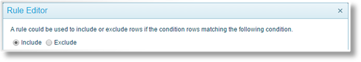
Select if the rule should Include or Exclude data when the Condition evaluates as true.
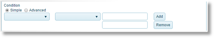
The rule can contain Simple or Advanced conditions. For Simple conditions, the following settings are available.
|
Source Value |
Select the column containing the data to be evaluated. |
|
Comparison |
Select how the data will be evaluated. |
|
•Before |
The Source Value is less than the Comparison Value. |
|
•Before or equal |
The Source Value is less than or equal to the Comparison Value. |
|
•Equal |
The Source Value is equal to the Comparison Value. |
|
•Not equal |
The Source Value is not equal to the Comparison Value. |
|
•After |
The Source Value is greater than the Comparison Value. |
|
•After or equal |
The Source Value is greater than or equal to the Comparison Value. |
|
•Is empty |
The Source Value is blank. No Comparison Value is required for this option. |
|
•Is not empty |
The Source Value contains any value at all. No Comparison Value is required for this option. |
|
•Starts with |
The Source Value begins with the full Comparison Value. |
|
•Does not start with |
The Source Value does not begin with the full Comparison Value. |
|
•Ends with |
The Source Value ends with the full Comparison Value. |
|
•Does not end with |
The Source Value does not end with the full Comparison Value. |
|
•Contains |
The Source Value includes the full Comparison Value anywhere within the data. |
|
•Does not contain |
The Source Value does not include the full Comparison Value anywhere within the data. |
|
•Between |
The Source Value falls between the two Comparison Values. |
|
•Not between |
The Source Value does not fall between the two Comparison Values. |
|
•In list |
The Source Value matches at least one entry in the Comparison Values. |
|
•Not in list |
The Source Value does not match any entry in the Comparison Values. |
|
Comparison Values |
If one or more Comparison Values are required, enter the values in the fields. For a list of values, click the Add button to add additional fields, or click Remove to remove a field. |

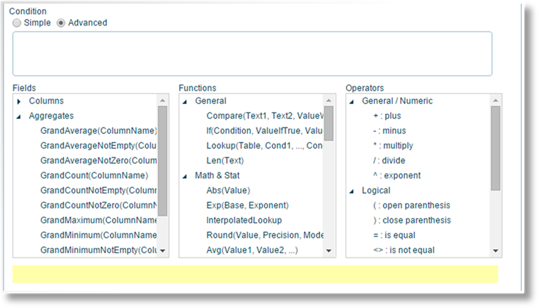
For Advanced conditions, a formula can be entered manually, assembled from options provided below, or any combination of the two. Pointing to an option displays a description in the yellow field at the bottom of the window.
|
Formula Field |
The condition formula is assembled in this field. Selecting any option from the lists inserts that option at the current cursor position. Text and values can also be typed in manually. |
|
Fields |
Inserts placeholders that retrieve data from the current data view. |
|
•Columns |
Provides the columns from the current data view. |
|
•Aggregates |
Provides options for all data within a selected column. Once an aggregate is inserted, a Column must be specified within the parentheses. |
|
Functions |
Inserts functions for calculations, logical structures, and retrieving data from the system. |
|
•General |
Provides options such as comparisons and using system triggers. |
|
•Math & Stat |
Provides mathematical options. |
|
•Date & Time |
Provides options to retrieve and manipulate dates and times. |
|
Operators |
Inserts operators to structure the formula. |
|
•General / Numeric |
Provides the standard mathematical symbols. |
|
•Logical |
Provides options and characters for comparisons and structuring the formula. |
|
•Data Type |
Used to verify what type of data is provided. |
|
•Text |
Used to combine values. |
5. Click OK to save the rule and close the window, or click Cancel to close the window without saving the rule.
Custom formatting can be applied to highlight data within a selected view. The formatting rules can be simple conditions or advanced logical structures, which will be evaluated for each row in the table.
1.
Open the Control panel for the selected view, and click the
Options button to open the Configuration
panel.
2.
Expand the Options category, and select the Conditional Formatting
tab .
3.
The title provides a summary of the rule conditions. Click and drag the
Move icon to
change the order of the rules. Click to delete the rule.
4.
Click the title to view an existing formatting rule, or click the Add new
rule icon to
create a new rule. The Rule Editor window opens.
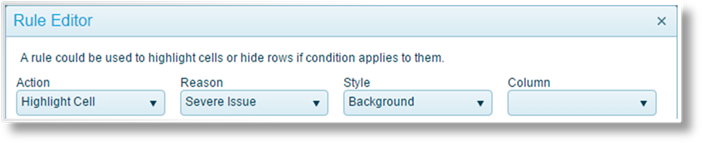
Define the formatting that should be applied when the Condition evaluates as true.
|
Action |
Select how the formatting will be applied. |
|
•Highlight Cell |
The cell in the selected Column will be highlighted. |
|
•Highlight Row |
The entire row will be highlighted. |
|
•Blank Value |
The cell in the selected Column will be blank. |
|
Reason |
The highlight color is set by the selected Reason. This field is available when Action is set to Highlight Cell or Highlight Row. |
|
•Severe Issue |
|
|
•Issue |
|
|
•Severe Warning |
|
|
•Warning |
|
|
•Good |
|
|
•Very Good |
|
|
•Excellent |
|
|
•Very Excellent |
|
|
Style |
Select the appearance of the highlight. This field is available when Action is set to Highlight Cell or Highlight Row. |
|
•Background |
|
|
•Box |
|
|
•Circle |
|
|
•Disk |
|
|
Column |
Select the column to be highlighted or blanked. This field is available when Action is set to Highlight Cell or Blank Value. |

The rule can contain Simple or Advanced conditions. For Simple conditions, the following settings are available.
|
Source Value |
Select the column containing the data to be evaluated. When the Action field is set to Highlight Cell or Blank Value, this field will be automatically set to the Column selected in the format settings. |
|
Comparison |
Select how the data will be evaluated. |
|
•Before |
The Source Value is less than the Comparison Value. |
|
•Before or equal |
The Source Value is less than or equal to the Comparison Value. |
|
•Equal |
The Source Value is equal to the Comparison Value. |
|
•Not equal |
The Source Value is not equal to the Comparison Value. |
|
•After |
The Source Value is greater than the Comparison Value. |
|
•After or equal |
The Source Value is greater than or equal to the Comparison Value. |
|
•Is empty |
The Source Value is blank. No Comparison Value is required for this option. |
|
•Is not empty |
The Source Value contains any value at all. No Comparison Value is required for this option. |
|
•Starts with |
The Source Value begins with the full Comparison Value. |
|
•Does not start with |
The Source Value does not begin with the full Comparison Value. |
|
•Ends with |
The Source Value ends with the full Comparison Value. |
|
•Does not end with |
The Source Value does not end with the full Comparison Value. |
|
•Contains |
The Source Value includes the full Comparison Value anywhere within the data. |
|
•Does not contain |
The Source Value does not include the full Comparison Value anywhere within the data. |
|
•Between |
The Source Value falls between the two Comparison Values. |
|
•Not between |
The Source Value does not fall between the two Comparison Values. |
|
•In list |
The Source Value matches at least one entry in the Comparison Values. |
|
•Not in list |
The Source Value does not match any entry in the Comparison Values. |
|
Comparison Values |
If one or more Comparison Values are required, enter the values in the fields. For a list of values, click the Add button to add additional fields, or click Remove to remove a field. |
For Advanced conditions, a formula can be entered manually, assembled from options provided below, or any combination of the two. Pointing to an option displays a description in the yellow field at the bottom of the window.
|
Formula Field |
The condition formula is assembled in this field. Selecting any option from the lists inserts that option at the current cursor position. Text and values can also be typed in manually. |
|
Fields |
Inserts placeholders that retrieve data from the current data view. |
|
•Columns |
Provides the columns from the current data view. |
|
•Aggregates |
Provides options for all data within a selected column. Once an aggregate is inserted, a Column must be specified within the parentheses. |
|
Functions |
Inserts functions for calculations, logical structures, and retrieving data from the system. |
|
•General |
Provides options such as comparisons and using system triggers. |
|
•Math & Stat |
Provides mathematical options. |
|
•Date & Time |
Provides options to retrieve and manipulate dates and times. |
|
Operators |
Inserts operators to structure the formula. |
|
•General / Numeric |
Provides the standard mathematical symbols. |
|
•Logical |
Provides options and characters for comparisons and structuring the formula. |
|
•Data Type |
Used to verify what type of data is provided. |
|
•Text |
Used to combine values. |
5. Click OK to save the rule and close the window, or click Cancel to close the window without saving the rule.


 step
through the entries.
step
through the entries.


 will be displayed in the top
right of the tile whenever there are criteria rules applied to the current
data view. The user can click the icon to view the criteria.
If disabled, the icon will not be shown.
will be displayed in the top
right of the tile whenever there are criteria rules applied to the current
data view. The user can click the icon to view the criteria.
If disabled, the icon will not be shown. or descending
  order. Click
  or descending
  to add
additional fields, or click the Delete icon
to add
additional fields, or click the Delete icon  to remove a
field.
to remove a
field.