
Individual fields are one of the most basic components of the workflow, each one capturing an element of the submission or claim information.
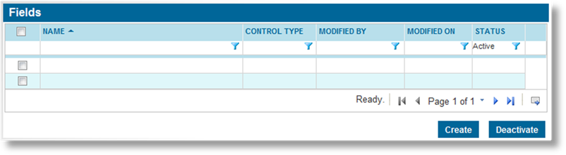
1. In the main menu, select Product Design, then select Workflow Configurations, then Fields. A list of all available fields is displayed.
Some columns have been hidden.
|
|
Tip: By default, only Active fields are displayed. Clear the filter in the Status column to view all fields. |
2. Click Create. The Field Management page opens.
3. Complete the necessary information. Fields marked with a red asterisk * are required.
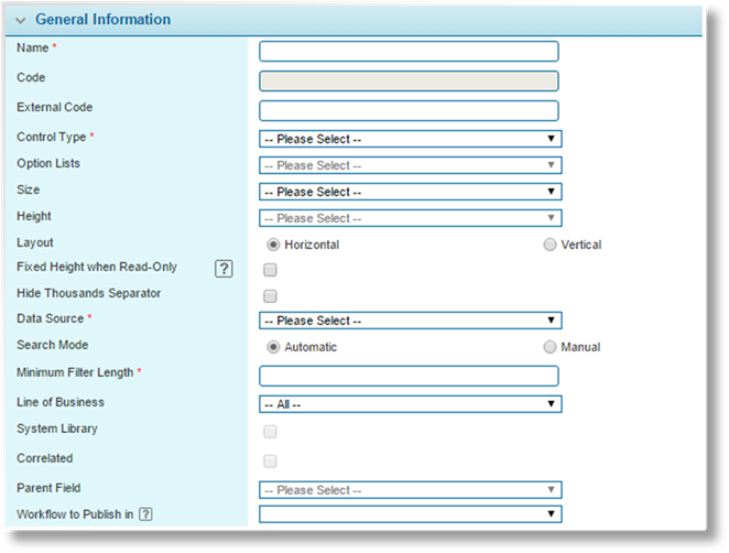
|
Name |
Enter the name of the field. This is the internal name, used to select this field when connecting it to other elements of the form. This name does not appear on the form itself. |
|
Code |
This is an internal reference name which is generated by the system when the field is saved. |
|
External Code |
This field is used for integration between Bridge and external systems or modules. This can be used in multiple ways. |
|
|
The code should not include spaces. Any spaces are removed when the field is saved. In addition, special characters other than underscore ( _ ) should be avoided. |
|
•Genoa System |
For integration with the Genoa system, this code should match the Client Code field in the related custom field (EDF) in Genoa. |
|
•Billing Module |
For integrations with system data in the Billing module, enter the code for the integration field. |
|
|
This field will display the current value of the integration field, although the value will be read-only, and changes to the field will not be saved. |
|
|
For a list of available integration fields, see the Billing Integration Fields section. |
|
•Claims Module |
Fields can be integrated between the Policy and Claims modules, allowing Policy information to be pulled into a Claim when a policy is selected. There are two ways to achieve this. |
|
|
− Shared Field: A single field is used in both the Policy workflow and the Claims workflow. The External Code for this field should have the "Bridge.Policy." prefix, such as "Bridge.Policy.CoverageRegion". |
|
|
− Linked Fields: Two fields are linked, one in the Policy workflow and one in the Claims workflow. Both fields should have the same External Code, prefixed with "Bridge.Policy.", such as "Bridge.Policy.CoverageRegion". |
|
|
Whenever a policy is selected for a claim, including changing or re-selecting a policy, the claims field will be populated with the data from the associated policy field. The claims field can then be used normally for features such as calculations, conditions, and generated documents. |
|
|
Note that changes to the policy field will not automatically be copied to the claims field. The data will only be copied when selecting a policy in the claim. |
|
|
In addition, any changes to the claims field will not be copied to the policy field, and will be replaced with the policy field data if the policy is re-selected. |
|
Control Type |
Select the type of field. |
|
•Checkbox |
A single checkbox, that can be checked or unchecked. |
|
| |
|
•Checkbox Group |
A group of two or more checkboxes, arranged horizontally, where each one can be checked or unchecked. |
|
| |
|
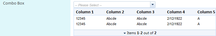
•Combo Box |
An advanced dropdown list, displaying multiple columns of data from a data source such as a pre-defined lookup table, a grid within the workflow, or a web service. This list is searchable by entering characters, and the selected option can populate multiple fields on the screen, as defined in the data source. |
|
| |
|
•Date Picker |
A field where the date can be entered manually, or selected from a calendar lookup. |
|
| |
|
•Drop Down |
A simple drop down list, displaying selections from an Option List. |
|
| |
|
•File Upload |
A field that allows the user to upload a single file. The user can click the Select or Drop File to Upload button to open a standard file selection window, or drag and drop a file onto the field. Once the file has been uploaded, it can be viewed by clicking the link or deleted with the Delete button. |
|
|
Note that this type of field should not be placed as the first column in a grid, or the link will open the record instead of downloading the file. |
|
| |
|
| |
|
| |
|
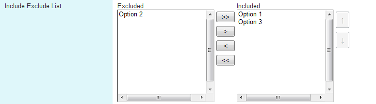
•Include Exclude List |
Creates two fields with controls to move items between the Include and Exclude sides. |
|
| |
|
•Label |
This option displays the text entered in the Default field, and cannot be changed by the user. This can be used to insert additional information into the form. Text must be entered in the Default field, and wraps around according to the selected Size. |
|
| |
|
•Multi Select |
A list of checkboxes, arranged vertically, allowing one or more items to be checked. |
|
| |
|
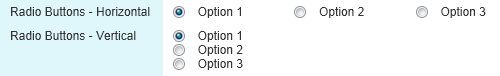
•Radio Buttons |
A group of two or more options, where only one can be selected. |
|
| |
|
|
Note: The vertical or horizontal orientation can be selected with the Layout option further down in the panel. |
|
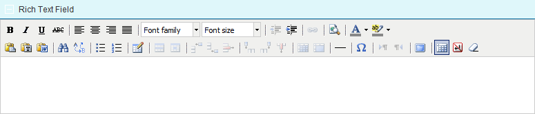
•Rich Text |
A large text-entry field with formatting tools to display and produce rich text content. Formatting in these fields is maintained when the data is pulled into generated documents. |
|
| |
|
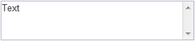
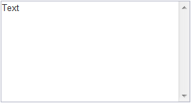
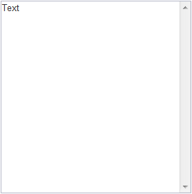
•Text Area |
A multi-line box used for blocks of simple text. |
|
| |
|
•Textbox |
A single-line field for simple text. |
|
| |
|
•Textbox (Decimal) |
Used for numerical values that may include decimals. If a Rounding Precision (see below) is not specified, the field defaults to two decimal points. |
|
| |
|
•Textbox (Email) |
A single-line field for one or more email addresses. Multiple addresses should be separated by commas. The system validates that all addresses are properly formatted. |
|
| |
|
•Textbox (Integer) |
Used for numerical values, but only accepts whole numbers. |
|
| |
|
Option Lists |
For control types that include multiple options, select the list of options to be available. The option list should be created first. See the Option Lists section for details. |
|
Size |
Available for Control Types with variable widths. Select the size of the field. This can be applied to the Label, Text Area, Text Box, Textbox (Decimal), Textbox (Email), and Textbox (Integer) control types. |
|
|
Note: Small size is not supported for Text Area and Textbox (Email), and Large size is not supported for Textbox (Decimal) and Textbox (Integer). |
|
•Small |
The field is 124 pixels wide, including any scrollbars. |
|
|
|
|
•Medium |
The field is 274 pixels wide, including any scrollbars. |
|
|
|
|
•Large |
The field is 399 pixels wide, including any scrollbars. |
|
|
|
|
•Page Width |
This option is currently inactive. |
|
Height |
For multi-line fields, this selects the height of the box. This can be applied to the Include Exclude List, Rich Text, and Text Area control types, and the exact height varies for each. |
|
•Short |
For Include Exclude List fields, the height is 135 pixels, including the scrollbars and labels. For Rich Text fields, the height is 288 pixels, including the header and tool box. For Text Area fields (displayed below), the height is 56 pixels. |
|
|
|
|
•Medium |
For Include Exclude List fields, the height is 255 pixels, including the scrollbars and labels. For Rich Text fields, the height is 538 pixels, including the header and tool box. For Text Area fields (displayed below), the height is 147 pixels. |
|
|
|
|
•Tall |
For Include Exclude List fields, the height is 495 pixels, including the scrollbars and labels. For Rich Text fields, the height is 838 pixels, including the header and tool box. For Text Area fields (displayed below), the height is 277 pixels. |
|
|
|
|
Layout |
Available when the Radio Buttons option is selected for the Control Type. This selects if the options are displayed in a Horizontal or Vertical arrangement. The horizontal arrangement conserves space in the form, while the vertical arrangement allows for longer descriptions. |
|
|
|
|
Fixed Height when Read-Only |
Available when the Rich Text option is selected for the Control Type. This controls how the field is displayed when in read-only mode (either as a default setting or due to a field override rule). When checked, the field always displays at the height selected above. A scrollbar becomes available if the content exceeds the size of the field. When unchecked, the field height shrinks or expands to match the content of the field. |
|
Hide Thousands Separator |
Available when the Textbox (Integer) option is selected for the Control Type. This prevents the thousands separator from being shown in the displayed value, while maintaining the validation to ensure the value does not contain decimals or other characters. This is useful for displaying serial numbers or the year. |
|
Data Source |
This field is available when Combo Box is selected as the Control Type. Select the data source containing the necessary configuration. See the Data Source section for more information. |
|
Search Mode |
This field is available when Combo Box is selected as the Control Type. A combo box can be searched by entering one or more characters to filter the content. |
|
•Automatic |
An Automatic search will begin once the user has entered a minimum number of characters defined in the Minimum Filter Length field. The search will refresh with each character added after the minimum. |
|
•Manual |
A
Manual search adds a search icon |
|
|
Manual search is recommended when using large tables of data, or when using web services. This will result in better performance in both cases, and some web services incur charges for each search. |
|
Minimum Filter Length |
This field is available when Automatic is selected as the Search Mode. Enter the minimum number of characters to be entered before the filtered results are displayed. If the minimum length is zero, all content is available immediately. |
|
|
The user can always enter more than the minimum number of characters to further refine the search. |
|
Line of Business |
Select a Line of Business from the list of industry presets, or select All to make the field available to all lines. |
|
System Library |
This option is currently inactive. |
|
Correlated |
Correlated fields cause the selection of any option in the parent field to define the available options in the child field. Check the Correlated checkbox if this field is to be used as a parent or child. |
|
Parent Field |
If this field is to be a child field in a correlated pairing, select the parent field from this list. |
|
Workflow to Publish in |
This field is available when the current field has been included in at least one published workflow. Only workflows that have been published at least once will be available. Changes made to the Calculated Field Formula field will be published to the selected workflow when the Publish button on this page is clicked. |
|
|
The purpose of publishing from this page is to provide a quick way to publish changes made to the Calculated Field Formula field. To publish any other changes on this page, save them and then publish the associated workflow. |
|
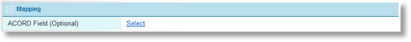
ACORD Field |
This feature is currently not in use. |
|
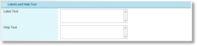
Label Text |
Enter the label to appear next to the field in the workflow. |
|
Help Text |
Enter the help
text to be shown when the user points to the Help icon |
|
|
Tip: Once the field has been saved, the Label Text and Help Text become available in the Custom Labels section. This allows translated versions of the text to be uploaded for when the browser is set to different languages. The text entered here will be set as the default English text. For details on customizing languages, see the Custom Labels section. |
|
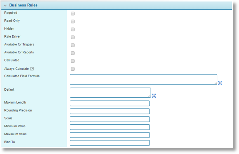
Required |
If checked, the user must complete the field before they can save the screen. Rules can be defined to override this behavior based on user type or certain circumstances. |
|
Read-Only |
If checked, the field displays its current or default value, and cannot be changed. Rules can be defined to override this behavior based on user type or certain circumstances. |
|
Hidden |
If checked, the field is not displayed on the submission form. Rules can be defined to override this behavior based on user type or certain circumstances. |
|
Rate Driver |
If checked, the field can be selected when setting up rates calculations. This option is only available for numeric fields. |
|
Available for Triggers |
If checked, the field can be selected when setting up a trigger. |
|
Available for Reports |
If checked, this field is available for use in reports (such as Cognos). |
|
Calculated |
If checked, the value of the field is calculated from other fields instead of taking user input directly. |
|
Always Calculate |
This setting is applicable when Calculated is checked. The system evaluates calculated fields quite often, in response to actions such as navigation, quote calculation, validation rules, and automated scheduled calculations. Each calculated field adds to the processing time for the calculation pass. |
|
|
When this option is checked, this calculated field will be evaluated every time the system performs a calculation pass. When unchecked, this field will only be calculated when it is required for another calculation, improving performance. |
|
Calculated Field Formula |
If Calculated has been checked, the formula should be entered in this field. Please see the Building Formulas section for detailed instructions on preparing formulas. |
|
Default |
If the field should contain a default value, enter it here. |
|
When viewing settings for a Rich Text Field type, the Default box appears at the bottom of the panel instead and has additional functionality. Please see the Setting Default Values for Rich Text Fields section. | |
|
When providing a default value for a Date Picker field, the date must be in the full system format "2014-10-28T18:16:12.3313239-04:00". | |
|
Maximum Length |
This value defines the maximum number of characters that can be entered in the field. When a user is entering information, the cursor stops at the set number of characters. If pasting information into the field, only the set number of characters are pasted. This option only functions for TextBox and Textbox (Email) control types. |
|
Rounding Precision |
This value defines the number of decimal spaces permitted in the field. If a user attempts to enter a value with too many decimal spaces, an error message asks that they correct the value. |
|
Scale |
This option is currently inactive. |
|
Minimum Value |
Available when Textbox (Decimal) or Textbox (Integer) are selected for the Control Type. The field will not accept any value less than this setting. |
|
Maximum Value |
Available when Textbox (Decimal) or Textbox (Integer) are selected for the Control Type. The field will not accept any value greater than this setting. |
|
Bind To |
This option allows the field to be mapped to a core field in the system. This field will display the current value of the core field, and any changes to this field will be saved to the core field. |
|
|
See the Full Placeholders List for Claims Information section for a list of system fields. Only fields with a Core Field Code are available for this option. Enter the Core Field Code here. |
|
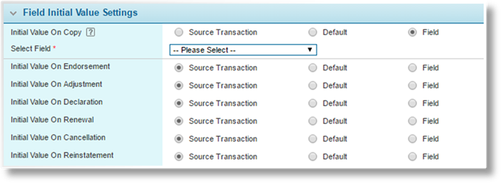
Initial Value On... |
Select whether the contents of this field will be copied when creating a new transaction through Copy, Endorsement, Adjustment, Declaration, Renewal, Cancellation, or Reinstatement. |
|
|
The Initial Value On Copy setting also applies to copying grid rows, in any transaction type. |
|
•Source Transaction |
Copies the value of this field from the source transaction. |
|
•Default |
Instead of copying the value, this field resets to the Default value, or resets to blank if no Default value is defined. |
|
•Field |
Copies the value from a selected field in the source transaction. On selecting this option, the Select Field drop-down appears, listing active fields of the same type and same line of business (or all lines of business). Select the field to copy the value from. In the case of a calculated field, this will copy the calculated value, and not the formula itself. |
4. Click Add to save the field but remain on the page, click Add & Close to save the field and return to the fields list, or click Close to return to the fields list without saving the field.
When viewing the configuration for Rich Text Field types, the Default box has additional functionality.
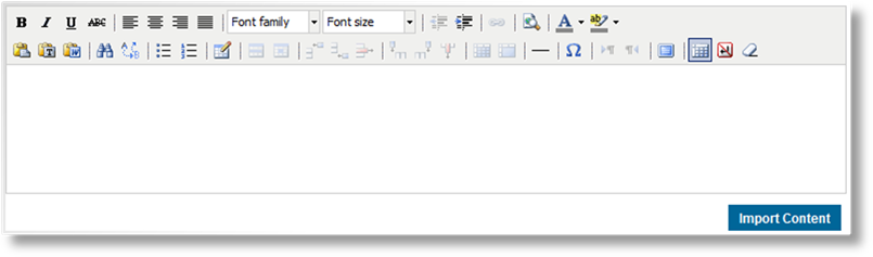
All text can be formatted using the options in the toolbar.
Existing clauses can be inserted from the clause library.
1. Click Import Content. The Import Content page opens.
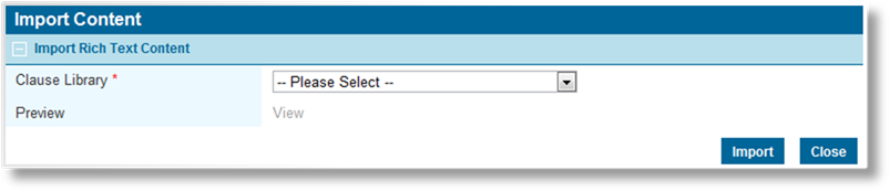
2. Select a clause from the Clause Library field. Click on the View link to preview the selected clause.
3. Click Import to return to the Field Management page and insert the clause at the end of the current default text, or click Close to return to the Field Management page without adding the clause.
4. Click Save once the default text is complete.
1. In the main menu, select Product Design, then select Workflow Configurations, then Fields. A list of all available fields is displayed.

Some columns have been hidden.
|
|
Tip: By default, only Active fields are displayed. Clear the filter in the Status column to view all fields. |
2. Click a link in the Name column to view the field details. If there are a large number of available fields, see the Using Grids section for help on finding the appropriate field.
3. See the section on Creating a New Field for a detailed description of the fields. All fields may be edited, if necessary, except for the System Reference name. The Status panel is included once the field has been saved.
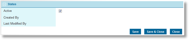
|
Active |
Marks the field as active and available for use. If unchecked, the field remains linked to any existing forms, but cannot be used for new forms. |
|
Created By |
Identifies the date and time the field was created, and the user who created it. |
|
Last Modified By |
Identifies the last date and time the field was changed, and the user who made the changes. |
4. Click Save to save any changes and remain on the page, click Save & Close to save and return to the fields list, or click Close to return to the fields list without saving any changes.
1. In the main menu, select Product Design, then select Workflow Configurations, then Fields. A list of all available fields is displayed.

Some columns have been hidden.
|
|
Tip: By default, only Active fields are displayed. Clear the filter in the Status column to view all fields. |
2. Click a link in the Name column to view the field details. If there are a large number of available fields, see the Using Grids section for help on finding the appropriate field.
3. Click the Copy button. The Copy Management page opens.

4. Enter the Name of the new field.
5. Click Next to save the field and proceed to the Field management page for the new field, or click Cancel to return to the original field without saving the copy.
6. The new field is available in the fields list, and can be edited as needed.
|
|
Notes: The Correlated and Parent Field settings cannot be copied due to the unique connections between the field and the parent. When copying a correlated field, a new correlation must be created manually. |
|
An Inactive field can be copied, with the copy being Active by default. |
The content of the Calculated Field Formula field can be published to a specified workflow from the Field Management page. This allows it to be quickly published for testing or to be used immediately without publishing the rest of the workflow.
|
|
Notes: |
|
This feature can only be used for a field that has been included in a published workflow and is still part of that workflow. | |
|
If the field is not included in any published workflow, this feature will not be available. | |
|
The purpose of this feature is to quickly publish changes to the Calculated Field Formula field. It should not be used to publish changes to any other settings for the field. |
1. In the main menu, select Product Design, then select Workflow Configurations, then Fields. A list of all available fields is displayed.
Some columns have been hidden.
|
|
Tip: By default, only Active fields are displayed. Clear the filter in the Status column to view all fields. |
2. Click a link in the Name column to view the field details. If there are a large number of available fields, see the Using Grids section for help on finding the appropriate field.
3. In the Workflow to Publish in drop down, select the workflow to which the system will publish the content of the Calculated Field Formula field.
4. Make any necessary changes to the Calculated Field Formula field.
5. Click Save.
6. Click Publish.
7. The system will display a confirmation message or any errors. If the publishing process was successful, the changes will be in effect.
Once created, a field cannot be deleted. It can be deactivated, which leaves it linked to any existing forms, but prevents it from being used for new forms.
1. In the main menu, select Product Design, then select Workflow Configurations, then Fields. A list of all available fields is displayed.
Some columns have been hidden.
|
|
Tip: By default, only Active fields are displayed. Clear the filter in the Status column to view all fields. |
2. Locate the field or fields to be deactivated. If there are a large number of available fields, see the Using Grids section the Using Grids section of the User Guide - Introduction document for help on finding the appropriate fields.
3. Check the boxes for all fields to be deactivated.
4. Click Deactivate, then confirm the deactivation when prompted to do so. All selected fields are deactivated. If the fields list is still defaulted to only show active fields, they disappear from the list.
|
|
Tip: Individual fields can also be deactivated or reactivated directly through the field record. See the section on Viewing and Modifying a Field for details. |


 to the right of the field.
The user can enter as much or as little information as they choose, then
click the search icon to retrieve the appropriate results.
to the right of the field.
The user can enter as much or as little information as they choose, then
click the search icon to retrieve the appropriate results. next to the field. If no
help text is provided, the Help icon is not shown.
next to the field. If no
help text is provided, the Help icon is not shown.