When creating a new portal for a specific product or distributor, or when modifying the default portal for your company's use, the color scheme can be customized to match company branding or color design preferences.
1. In the Main Menu, select Reference, then select Portals. The Portals page opens with a list of all available portals.
2. Click a link in the Name column to view a portal. The Portal - General Information page opens, and additional options become available in the Screens widget to the left of the page.
3. Select Appearance in the Screens widget. The Portal - Appearance page opens.
4. Complete the necessary information. Fields marked with a red asterisk * are required.

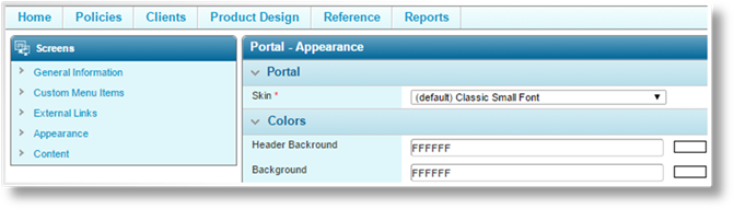
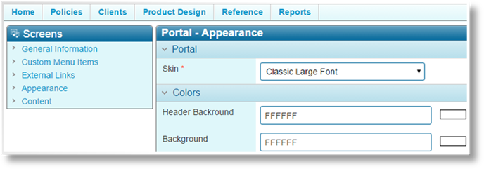
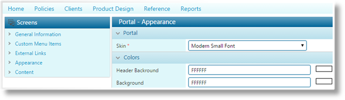
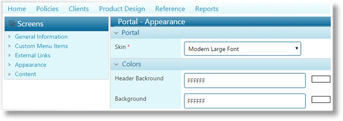
The Bridge system has multiple skins to change the general appearance of the site. Select an option in the Skin field.
|
Classic Small Font |
This is the default setting. |
|
|
|
|
Classic Large Font |
The classic configuration, but with larger fonts and fields. |
|
|
|
|
Modern Small Font |
Squared corners and fewer dividing lines. |
|
|
|
|
Modern Large Font |
The modern configuration, but with larger fonts and fields. |
|
|
|
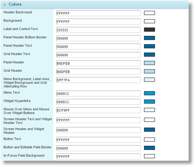
In the Colors panel, a series of groups allow individual colors to be assigned to multiple related elements. Clicking in the code field opens a color picker tool.
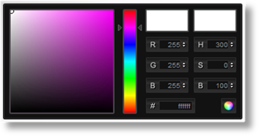
5. The controls in the color picker can be used to precisely define the colors.
For examples of the affected screen areas, see Portal Color Settings.
6. Once the colors have been defined for all groups, click Save. The saved changes are applied when the portal is published from the General Information page of the portal.