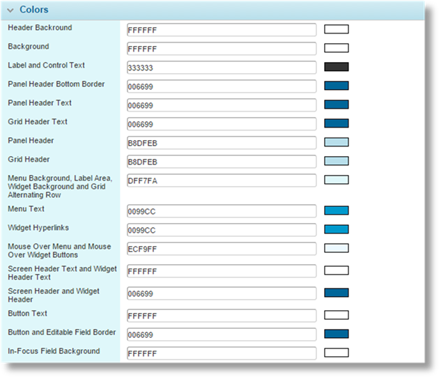
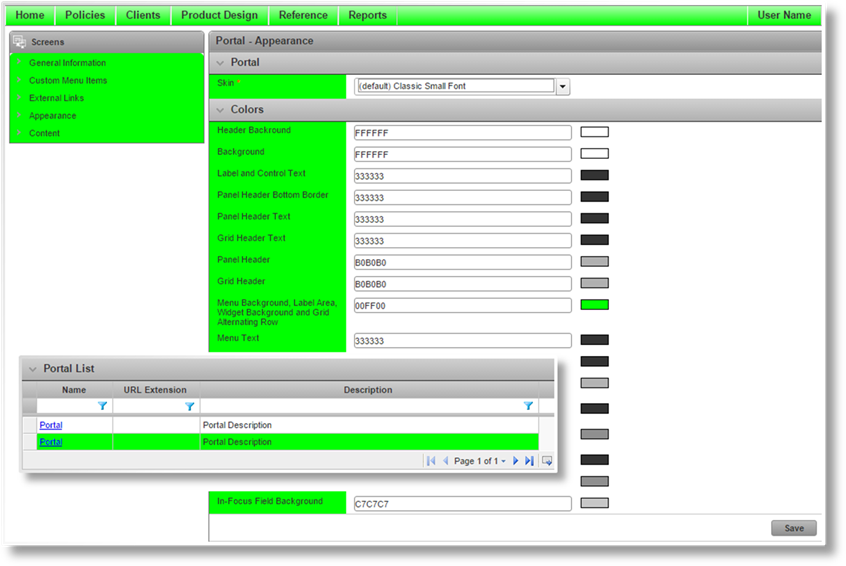
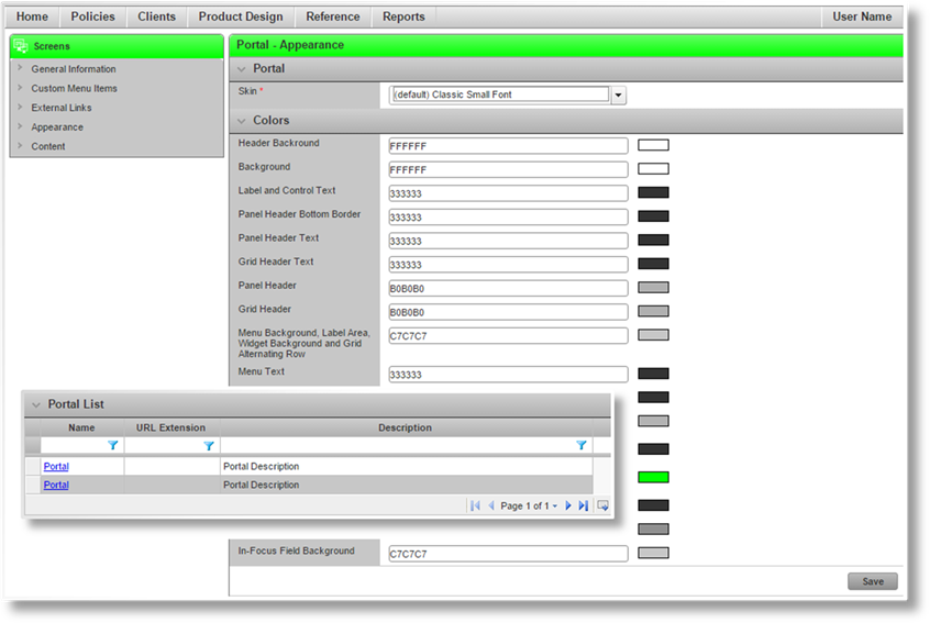
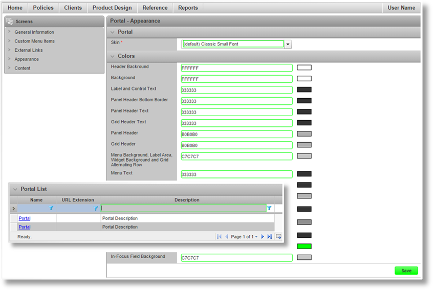
Almost all areas of the system can be customized to specific colors for each portal. This can be done to match corporate branding for companies and individual products.
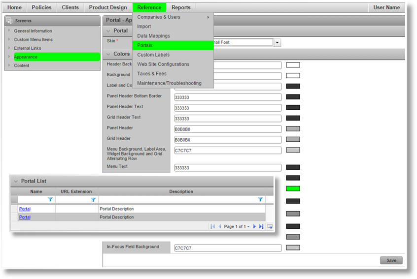
See the section on Defining the Appearance of a Portal for instructions on changing colors. This section lists the color groups and identifies the affected areas.
For a new licensee site, the default portal is preset with the default color scheme. Newly created portals also have this default color scheme.
Each color can be customized.
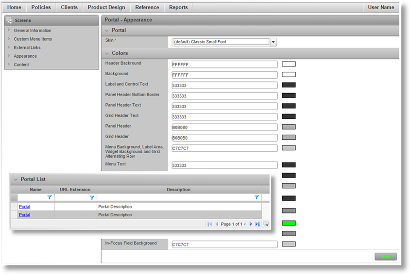
Once all screen elements have been customized, click Save. The color changes are applied when the portal is published.
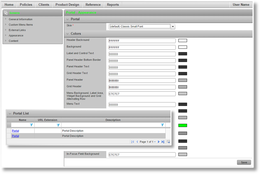
Header Background
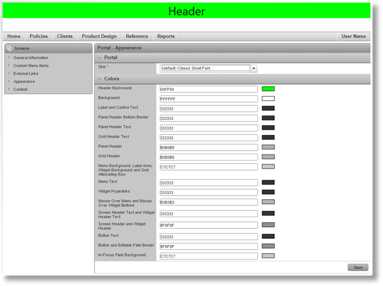
Affects the empty space behind the header content. If the header area is larger than the content, the Background color will be shown in the remaining space.
Background
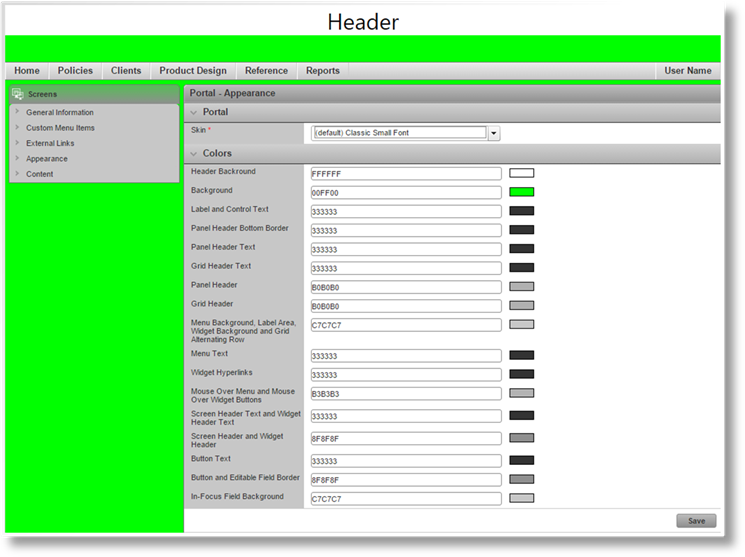
Affects the empty space behind all of the windows, menus, and widgets, as well as the header and footer areas.
Note that some screen elements are semi-transparent, and the background color will show through. This affects widget headers and certain colors in the progress bar.
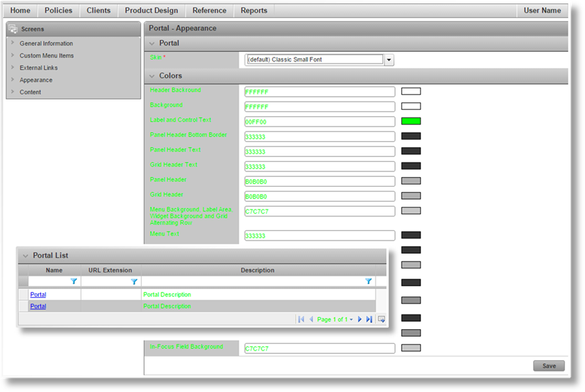
Label and Control Text
Affects the text in the label area, the text in the editable fields, static text (non-link) in the widgets, as well as messages and navigation controls in grids.
Panel Header Bottom Border
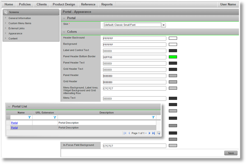
Affects the dividing line between the panel header and the content of the panel.
Panel Header Text
Affects the text in the panel headers.
Grid Header Text
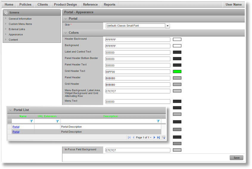
Affects the text in grid column headers.
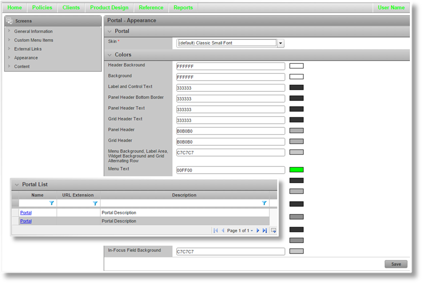
Panel Header
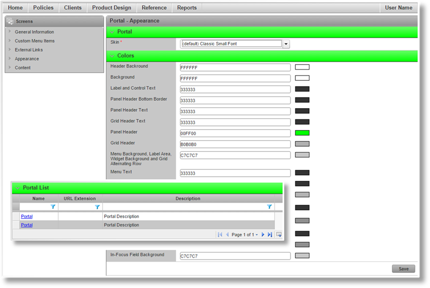
Affects the background in the panel headers.
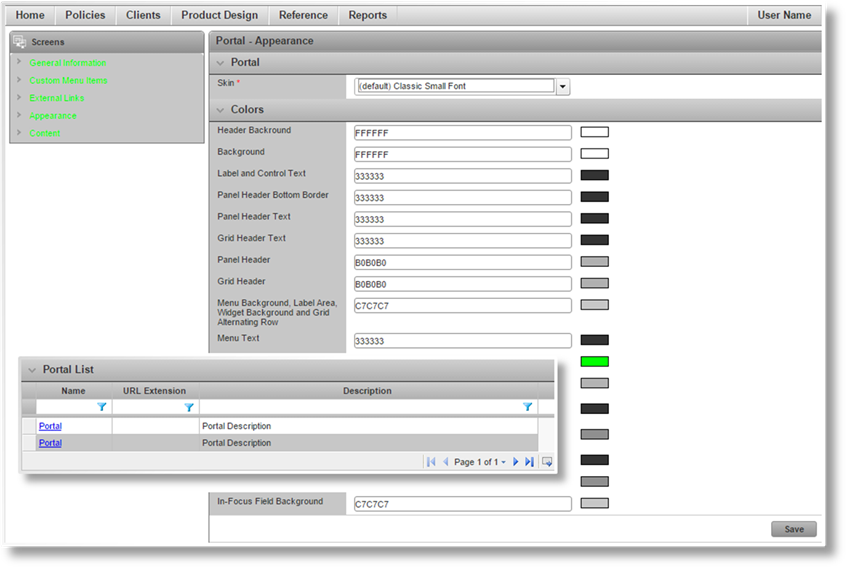
Grid Header
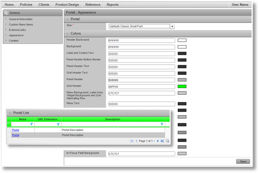
Affects the background in grid column headers.
Menu Background, Label Area, Widget Background and Grid Alternating Row
Affects the background of the main menu, widgets, label area in panels, and the alternating line highlighting in grids.
Menu Text
Affects the text in the main menu.
Widget Hyperlinks
Affects any hyperlink text in the widgets. Any static text in the widgets is controlled by the Label and Control Text setting.
Mouse Over Menu and Mouse Over Widget Buttons
Affects the highlighting of main menu and widget items as the mouse passes over them. This does not apply to links such as in the Common Screens, Policy Information, Client Information, or Premium widgets.
Screen Header Text and Widget Header Text
Affects the text in the screen header and widget headers.
Screen Header and Widget Header
Affects the backgrounds in the screen header and widget headers, as well as completed step icons in the Progress Bar.
Note that the widget headers are semi-transparent, allowing the background color to show through.
Button Text
Affects the text in buttons.
Button and Editable Field Border
Affects the background color of buttons, and the border color of fields. The border color does not apply to checkboxes, radio buttons, or include/exclude fields.
In-Focus Field Background
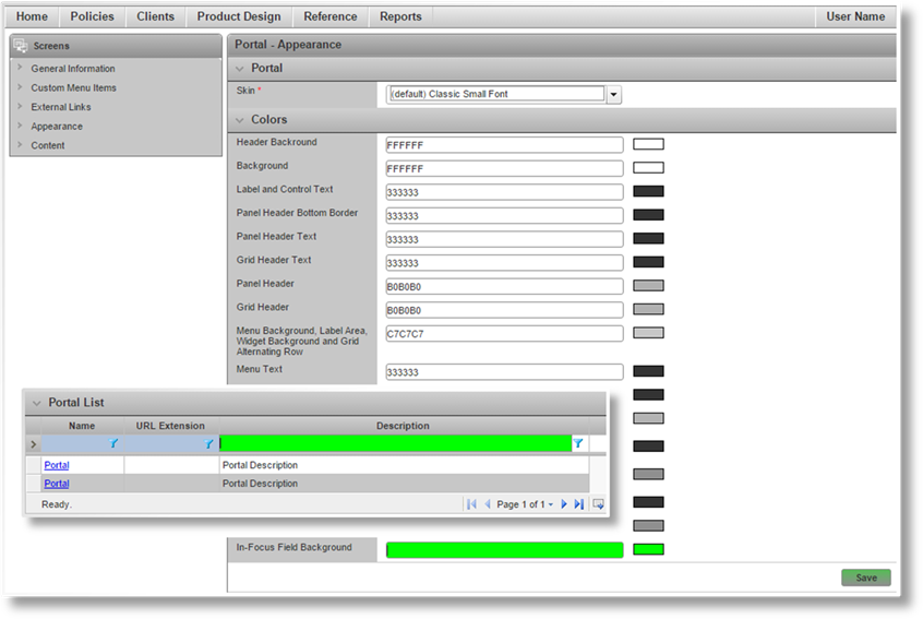
Affects the background color of selected fields, and applies a semi-transparent background to buttons when selected or clicked.