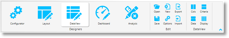
The DataView tool is used to design the tables, graphs, charts, etc. displayed within the tiles. Data is selected, formatted, and organized, then rules and links are created.
The Edit group contains the following standard options.
|
|
Open |
Opens the Select DataView panel to choose an existing dataview for editing. This same panel opens when entering the DataView section, and can be closed to use the New or Import options instead. |
|
|
Save |
Saves the current dataview and settings. |
|
|
New |
Opens the New DataView panel to create a new dataview. |
|
|
Options |
Opens the Configuration panel to change the settings for the current layout. |
|
|
Export |
Opens a standard Save window to export the current dataview to an XML file. Select a location, enter a filename, and click Save. |
|
|
Import |
Opens the Import DataView panel to import a dataview file created with the Export option. |
The DataView group contains the following options.
|
|
Cols |
Displays the DataView Columns screen, where data is assigned to columns and formatted. |
|
|
Data |
Displays the DataView Data screen, where sorting, subtotals, ranking, and grouping rules are configured. |
|
|
Criteria |
Displays the DataView Criteria screen. This option is unavailable at this time. |
|
|
Display |
Displays the DataView Display Modes screen. This option is unavailable at this time. |
The Select DataView panel opens to the right of the screen when selecting Open from the Edit group. Click X to close the panel again.
This panel is used to open an existing dataview configuration saved in the system.

Click the name to open the dataview in the DataView Columns screen.
The New DataView panel opens to the right of the screen when selecting New from the Edit group. Click X to close the panel again.
This panel is used to create a new dataview configuration.
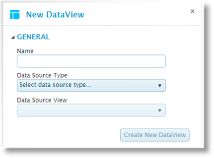
|
Name |
Enter the name of the new dataview. |
|
Data Source Type |
Select the type of data source. This will filter the options available in the Data Source View field. |
|
•Relational Database |
This option is not functional at this time. |
|
•REST Application Query |
This option is not functional at this time. |
|
•RSS Feeds |
This option is not functional at this time. |
|
•UX Forms |
This option is not functional at this time. |
|
•WebService Application Query |
Retrieves data from another system using a WebService integration. |
|
Data Source View |
Select the data source created in the Configurator section. |
Click Create New DataView to display the dataview in the DataView Columns screen. Note that the dataview is not yet saved at this point.
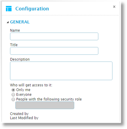
The Configuration panel opens to the right of the screen when selecting Options from the Edit group. Click X to close the panel again.
This panel is used to edit the configuration options for the current dataview.
|
Name |
Enter the name of the dataview. |
|
Title |
Enter the title to be displayed at the top of the dataview in Analysis mode. |
|
Description |
Enter a description of the dataview. |
|
Who will get access to it |
Select if the dataview is private or shared. This affects the ability to select the dataview in the Dashboard Design Tool, and the ability to see the view in Analysis mode. |
|
•Only me |
Only you will be able to see this dataview. |
|
•Everyone |
The dataview will be visible to all users. |
|
•People with the following security role |
Only accessible to users with a specific security role assigned to their user account. Select this option and enter the Code of the required security role. |
|
Created by |
Identifies the date and time the dataview was created, and the user who created it. |
|
Last Modified by |
Identifies the last date and time the dataview was changed, and the user who made the changes. |
The changes are applied immediately, but are not saved until the dataview itself is saved.
The Import DataView panel opens to the right of the screen when selecting Import from the Edit group. Click X to close the panel again.
This panel is used to import a dataview that has been exported to a file.
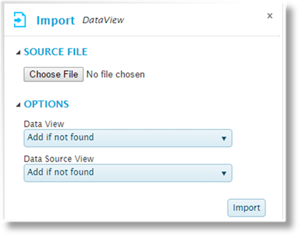
The Source File group is used to select the import file. Click the button to open a standard file browser window. Locate and select the appropriate export file. The file name appears next to the button.
The Options group controls how components will be imported. The following options are available:
|
− None |
This component will not be imported. |
|
− Add a new entity |
The import will be added as a new component, even if a component already exists with the same name. |
|
− Add if not found |
If a component exists with the same name, the import will not be performed. Otherwise, the import will be added as a new component. |
|
− Update existing. Add if not found |
If a component exists with the same name, it will be updated. Otherwise, the import will be added as a new component. |
|
− Update existing matching on Name |
If a component exists with the same name, it will be updated. Otherwise, the import will not be performed. |
The following components can be set for import.
|
Data View |
Select how the data view itself should be imported. |
|
Data Source View |
The Data Source associated to the view can be imported along with the view. Select how it should be imported. |
Click Import to import the file.
|
|
Notes: If one of the Update Existing options are selected and more than one matching item is found, the first matching item will be updated. |
|
If one of the Update Existing options are selected, the saved item is updated. If that item is currently open in the editor window, it will not show any changes immediately. Re-open the saved item to see the imported changes. If the item is saved before the imported changes are re-loaded, it will overwrite the imported changes. |
The Cols option switches to the DataView Columns editing screen. This screen is used to select the columns that will be displayed in the dataview and define the settings for each column.
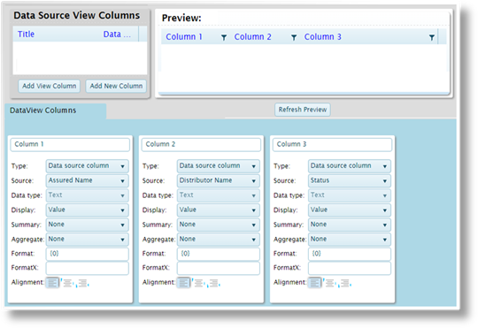
The screen is composed of three sections.
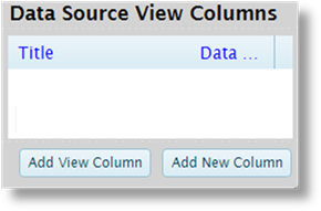
The Data Source View Columns section lists all available columns in the selected data source. The Title and Data type are displayed for each field.
Select a field and click Add View Column to add a column detail entry in the DataView Columns section below. This entry will include the default settings for the appropriate data type.
Click Add New Column to add a blank detail entry in the DataView Columns section below. This entry will have the base settings, and can be configured as needed. These blank entries are generally used to create new columns that are derived from other data, rather than pulling data directly from the data source.
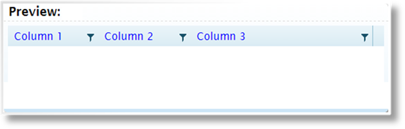
The Preview section shows how the data will appear with the current settings. Click the Refresh Preview button to show the results of any changes.
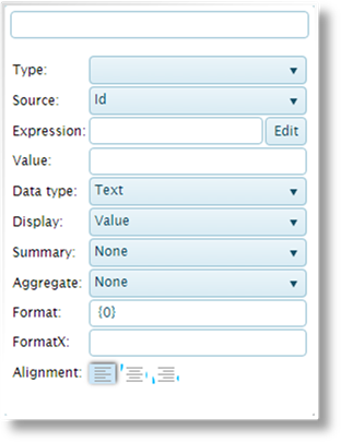
The DataView Columns section displays a column detail panel for each column in the dataview. These are used to define the settings for each column.
|
Header |
Enter the column header. |
|
Type |
Select the type of data. |
|
•Data source column |
This column will display data taken from the associated data source. |
|
•Calculated column |
This column will be calculated from data in other columns. |
|
•Constant value |
This column will display a single specified value. |
|
•Ranking value |
Instructions to be completed. |
|
Source |
This field is available when Data source column is selected as the Type. Select a column from the associated data source. |
|
Expression |
This field is available when Calculated column is selected as the Type. |
|
Value |
This field is available when Constant value is selected as the Type. Enter the text or value to be displayed in each row of the column. |
|
Data type |
Select the type of data in the column, Text, Integer, Decimal, Date, or Boolean. For Data source column and Ranking value columns, this will be preset to the appropriate data type. |
|
Display |
Select how the value will be displayed. |
|
•Value |
Displays the straight value. |
|
•Running total |
Displays a total of the current value plus all preceding values in the column. |
|
•Group running total |
Instructions to be completed. |
|
•Percent to total |
Displays the current value as a percentage of the total value for the column. |
|
•Percent to group |
Instructions to be completed. |
|
Summary |
Displays a Total line at the bottom of the table, containing a summary value for the column. |
|
•Average |
Displays an average of all rows. |
|
•Average of non empty |
Displays an average of all rows that include a value. Rows without a value in this column are omitted from the average. |
|
•Average of non zero |
Instructions to be completed. |
|
•Count |
Displays the total number of rows. |
|
•Count of non empty |
Displays the total number of rows that include a value. Rows without a value in this column are not counted. |
|
•Count of non zero |
Instructions to be completed. |
|
•Maximum |
Displays the highest value in the column. |
|
•Minimum |
Displays the lowest value in the column, including zero or no value. |
|
•Minimum of non empty |
Displays the lowest value in the column, including zero. |
|
•Minimum of non zero |
Instructions to be completed. |
|
•Sum |
Displays the total of all values in the column. |
|
Aggregate |
Instructions to be completed. |
|
•Average |
Instructions to be completed. |
|
•Average of non empty |
Instructions to be completed. |
|
•Average of non zero |
Instructions to be completed. |
|
•Count |
Instructions to be completed. |
|
•Count of non empty |
Instructions to be completed. |
|
•Count of non zero |
Instructions to be completed. |
|
•Maximum |
Instructions to be completed. |
|
•Minimum |
Instructions to be completed. |
|
•Minimum of non empty |
Instructions to be completed. |
|
•Minimum of non zero |
Instructions to be completed. |
|
•Sum |
Instructions to be completed. |
|
Format |
Enter the formatting code to define how the value is displayed. |
|
FormatX |
Instructions to be completed. |
|
Alignment |
Select if the data should be aligned to the left, centered, or the right. |
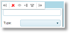
When hovering the mouse over a column detail panel, a control bar appears at the top of the panel.
|
|
Left / Right |
Shifts the column one space to the left or right. |
|
|
Remove |
Removes the column from the list. |
|
|
Hide / Show |
Hides the column, but leaves it available for various functions. The column detail panel is collapsed to a narrow vertical bar with the Header label displayed. Click the collapsed panel to expand it again. The background will appear gray for hidden columns. Click the icon again to show the column. |
|
|
Collapse |
Collapse the column detail panel to a narrow vertical bar with the Header label displayed. Click the collapsed panel to expand it again. |
|
|
Collapse All |
Collapse all column detail panels to narrow vertical bars with the Header labels displayed. Click any collapsed panel to expand it again. |
The Data option switches to the DataView Data editing screen. This screen is used to apply rules and settings that control the organization of the data within the dataview.
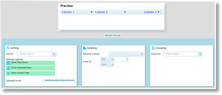
The screen is composed of four sections.
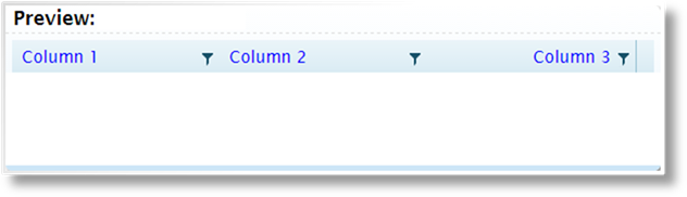
The Preview section shows how the data will appear with the current settings. Click the Refresh Preview button to show the results of any changes.
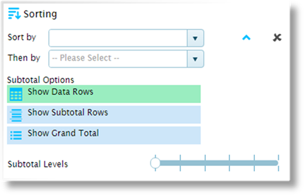
The Sorting section provides options for sorting the data and adding rows for totals. These are the default settings, which can be overridden in the dashboard design tool, as well as by each user in analysis mode.
|
Sort by |
Select the first sorted column. Click the arrows
to sort in ascending |
|
Then by |
Select all additional columns to sort by, in
order. Click the arrows to sort in ascending |
|
Subtotal Options |
Click one or more options for displaying totals and subtotals. |
|
•Show Data Rows |
Select this option to include the individual data rows. Without this option, only the selected total and subtotal lines will be displayed. |
|
•Show Subtotal Rows |
Displays a subtotal row for each unique entry in the selected Sort by column. |
|
•Show Grand Total |
Displays a grand total row at the bottom of the table. |
|
Subtotal Levels |
Instructions to be completed. |
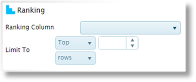
Instructions to be completed.
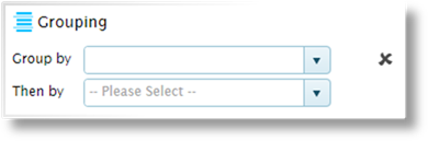
The Grouping section combines rows that have the same information in certain columns. Select the first Group by column. This will produce one row for each unique entry in that column.
When a Sort by column is selected, a Then by field is added below to group by additional columns. One row will be shown for each unique combination of all group columns.
Click  to delete a group column.
Instructions to be completed.
Instructions to be completed.


 /
/ 


 or descending
  order. Click
  or descending