and
and  icons or by clicking in an empty area
of the panel header, and they can be set to appear in collapsed form by
default.
icons or by clicking in an empty area
of the panel header, and they can be set to appear in collapsed form by
default.Panels are used to collect multiple fields, usually related, into a group for use in the workflow.
Panels are also used to define specific behaviors depending on a variety of factors such as the status of the submission or policy, the type of business, or the security settings of the user viewing the submission or policy. Individual behavior settings can also be applied to each of the fields attached to the panel, overriding the default settings of the fields when the conditions are met.
Panels can be manually collapsed and expanded using the and icons or by clicking in an empty area
of the panel header, and they can be set to appear in collapsed form by
default.
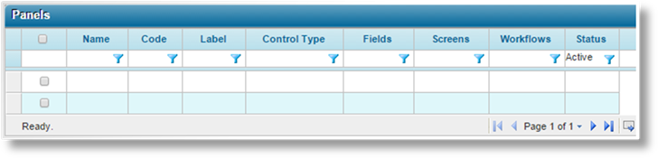
1. In the main menu, select Product Design, then select Workflow Configurations, then Panels. A list of all available panels is displayed.
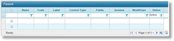
Some columns have been hidden.
|
|
Tip: By default, only Active panels are displayed. Clear the filter in the Status column to view all panels. |
2. Click Create. The Panel Management page opens.
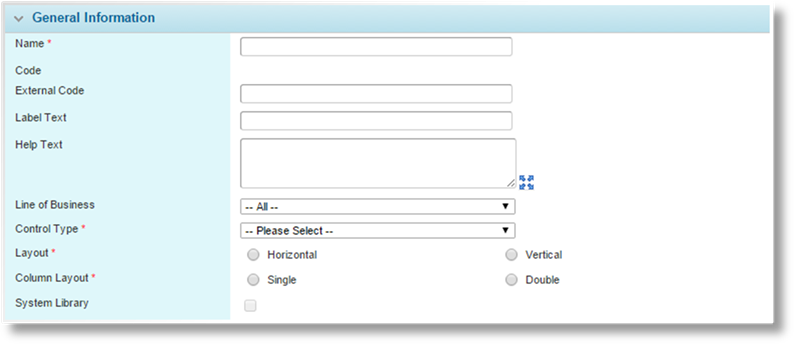
3. Complete the necessary information. Fields marked with a red asterisk * are required.
|
Name |
Enter the name of the Panel. This is the internal name, used to select this panel when connecting it to other elements of the form. This name does not appear on the form itself. |
|
Code |
This is an internal reference name which is generated by the system when the panel is saved. |
|
External Code |
This field is used for integration between Bridge and external systems. The code should not include spaces. Any spaces are removed when the field is saved. In addition, special characters other than underscore ( _ ) should be avoided. For View Grids, the code is inherited from the master grid and cannot be changed. |
|
Label Text |
Enter the label to be shown at the top of the panel. When the panel is collapsed, this label is the only part that shows, so the label should be descriptive enough for users to locate the fields they need. |
|
Help Text |
Enter the help
text to be shown when the user clicks on the Help icon |
|
|
Tip: If the Label Text and Help Text fields are both blank, the panel header will be hidden. This can be used to arrange panels so that they appear to be a single panel, while each panel maintains distinct display and override rules. Hiding the header removes the control to collapse or expand the panel. For this reason, any settings or overrides to collapse the panel will not be applied if the header is hidden. |
|
|
Once the panel has been saved, the Label Text and Help Text become available in the Custom Labels section. This allows translated versions of the text to be uploaded for when the browser is set to different languages. The text entered here will be set as the default English text. For details on customizing languages, see the Custom Labels section. |
|
Line of Business |
Select a Line of Business from the list of industry presets, or select All to make the panel available to all lines. For View Grids, the line of business is inherited from the master grid and cannot be changed. |
|
Control Type |
Select the format of the panel. For View Grids, the control type is inherited from the master grid and cannot be changed. |
|
•Form |
The fields are presented in order of sequence, arranged according to the Layout and Column Layout settings. |
|
•Grid |
The fields are aligned in a standard grid, with all common grid functions. An Add button opens either a detail window with the fields presented in order of sequence, arranged according to the Layout and Column Layout settings, or a tab workflow where the order of fields is defined by the workflow configuration. |
|
|
The user can add multiple entries, while clicking an entry in the grid opens the details page or tab workflow for that entry. |
|
•Premium Grid |
Like a standard grid, the user can add rows of data. However, two extra columns are added to calculate the Transaction Premium and Term Premium for each row. If a premium grid has another premium grid as a child (see below), another two columns are added for the Transaction Premium Rollup and Term Premium Rollup, summing the calculated value for each row and all child values (through multiple layers of child grids) associated with that row. |
|
|
Note: A normal user can add entries to a Premium Grid, but only users with the ability to delete premium values can delete an entry. This restriction does not apply to the normal grid. |
|
Layout |
This field is available for Form control types, and for Grid or Premium Grid control types when Window is selected as the Management Style. Select how the labels and fields will be positioned in the form or in the detail window. |
|
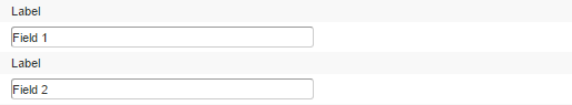
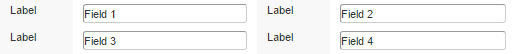
•Horizontal |
The labels will appear to the left of the field. This is the most common setting for fields with short labels. |
|
|
|
|
•Vertical |
The labels will appear above the fields. This is useful for fields with very long labels, such as a detailed question. |
|
|
|
|
Column Layout |
This field is available for Form control types, and for Grid or Premium Grid control types when Window is selected as the Management Style. Select how the fields will be arranged in the form or the detail window. |
|
•Single |
The panel will have a single column of fields. This provides the greatest amount of space for wide fields and specific field control types. |
|
|
|
|
•Double |
The panel will have two columns of fields. This is useful for panels with many short fields. |
|
|
|
|
|
Note: There are some field restrictions when using Double columns. |
|
•For Combo Box, Textbox, Textbox (Decimal), Textbox (Email), and Textbox (Integer) fields, if the Size is set to anything greater than Small, the field will be resized to fit the column. | |
|
|
•For Drop Down fields, if the Size is set to anything greater than Small, the field will be changed to Small when publishing the workflow. |
|
|
•File Upload, Include Exclude List, and Rich Text field types are too large and cannot be resized, so they cannot be included in a double-column layout. |
|
|
•Text Area fields can be included, but only if Vertical is selected as the Layout Type. The Horizontal layout is too wide. |
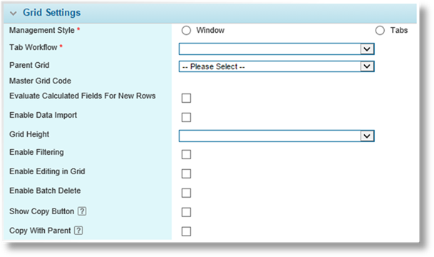
The Grid Settings panel is available when Grid or Premium Grid are selected as the Control Type.
|
Management Style |
Select how data will be entered in the grid. |
|
•Window |
Opens a window within the page, containing the fields selected for the panel. |
|
•Tabs |
Opens a set of tabbed screens in the center area of the page. The tab structure is created as a special type of workflow. |
|
Tab Workflow |
This option is available when the Tabs option is selected for the Management Style. Select the tabbed workflow for this grid. |
|
Parent Grid |
This option is not available for View Grids or grids that have associated View Grids. |
|
|
Select a parent grid, if applicable. In the workflow, one instance of the child grid is created for each row in the parent grid, ready to receive data directly related to that row. When a row is selected in the parent grid, any child grids will appear directly below the parent. The child grids display the data associated to the selected row in the parent, and will refresh as different rows are selected in the parent. |
|
|
The parent grid can have multiple child grids, all of which will appear below the parent, but a child grid can only have one parent. However, a child grid can have its own child grids, cascading down through the workflow screen. |
|
|
For grids using the Window option for Management Style, all child grids must be included in the same screen configuration as their parent. The child always appears below the parent, but the sequence will control the order when multiple children of the same parent are displayed. |
|
|
For grids using the Tabs option for Management Style, all grids within the selected Tab Workflow must be defined as children of the parent grid. Child grids from the Tab Workflow can also be included in the core workflow in a cascading structure, but are not required. |
|
|
Tip: When entering labels for child grids, it is recommended to choose labels that clearly define the relation to other grids within the hierarchy. There are different methods to achieve this: •Adding the parent name first, such as "Parent - Child". •Creating a numbered hierarchy, such as "Table 1.1", "Table 1.2", "Table 2.1", etc. Add leading characters to "indent" the label, such as "...Child". Note that leading spaces will be removed. |
|
|
Note: Tab workflows cannot contain cascading child grids themselves, but tab grids in the core workflow can be arranged in a cascading structure. |
|
Master Grid Code |
This field provides a link to the master grid. This field is only visible for View Grids, which display a subset of the fields from the master grid. See the description for the View Grids panel below. |
|
Evaluate Calculated Fields For New Rows |
This option is not available for View Grids. |
|
When checked, each time a new row is added to the grid, all calculated fields in the workflow are evaluated on opening the detail window, and again on saving the new row. | |
|
|
When unchecked, calculated fields are only evaluated on saving the new row. |
|
Enable Data Import |
With this option checked, users with the necessary right can import a spreadsheet to quickly populate the grid with a significant amount of data, or update existing data. |
|
Grid Height |
As rows are added to a grid, it expands and takes up more space on the screen. When it reaches the maximum height, it adds pages which can be navigated using the page controls in the bottom-right of the grid. |
|
|
The options are Small (10 rows), Medium (25 rows), and Large (50 rows). |
|
Enable Filtering |
This option enables the filter row in the grid, giving users greater control in finding and organizing data. |
|
Enable Editing in Grid |
Certain field types can be edited directly within the grid without having to open the detail window. Double-click a cell for an editable column to make changes. Clicking on another row or outside the grid saves the changes. Multiple cells can be edited in a single row, and the row saves on clicking outside of the row. |
|
|
Checking this box enables the feature for the current grid, and makes the Editable in Grid checkbox available for individual fields shown in the grid. |
|
Enable Batch Delete |
Enables the grid feature that allows multiple rows to be deleted simultaneously directly from the page containing the grid. |
|
|
When checked, a column of checkboxes will appear as the first column of the grid, allowing the user to select multiple rows to be deleted. A Delete button will also be made available to perform the deletion. |
|
|
Notes: The system deletes all child rows belonging to the deleted rows. |
|
After the deletion, the system performs a calculation pass, evaluating calculated fields according to their settings. Any Field Evaluation Rules set to the Delete Grid Row event will also be evaluated. | |
|
Deleting a row from a Master Grid removes it from any associated View Grids. Deleting a row from a View Grid removes it from the Master Grid. | |
|
Show Copy Button |
Enables the Copy button when viewing a row in the current grid, making it easier to enter multiple rows with similar information. |
|
|
Copying produces a new row where each field in the grid is duplicated, reset to default, or changed to match a source field, according to the Initial Value On Copy setting for each field. |
|
|
Copying may also include associated rows from child grids, according to the Copy With Parent settings for the child grids. |
|
Copy With Parent |
This option is applied if a parent grid has been selected. If no parent grid is selected, this option has no effect. |
|
|
If checked, copying a row in the parent grid will also copy all rows from the current grid that are associated to the parent row. Each field in the grid is duplicated, reset to default, or changed to match a source field, according to the Initial Value On Copy setting for each field. |
|
|
If unchecked, rows from the current grid will not be copied when the parent rows are copied. |
|
|
The copy cascades through multiple child grids that have this option enabled, even if the Show Copy Button option is not checked. |
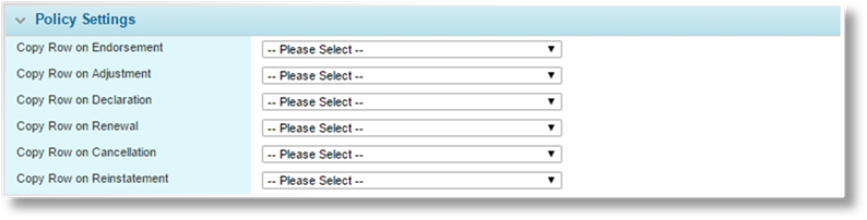
The Policy Settings panel is available when Grid or Premium Grid are selected as the Control Type, except for View Grids. This controls whether or not data in the grid is copied into the new transaction when creating an endorsement, adjustment, declaration, renewal, cancellation, or reinstatement.
Note that these settings do not apply when individual rows are copied, either directly or when a parent row is copied.
|
Copy Row on Endorsement |
Select a trigger to control copying when creating an endorsement transaction. |
|
Copy Row on Adjustment |
Select a trigger to control copying when creating an adjustment transaction. |
|
Copy Row on Declaration |
Select a trigger to control copying when creating a declaration transaction. |
|
Copy Row on Renewal |
Select a trigger to control copying when creating a renewal transaction. |
|
Copy Row on Cancellation |
Select a trigger to control copying when creating a cancellation transaction. |
|
Copy Row on Reinstatement |
Select a trigger to control copying when creating a reinstatement transaction. |
The trigger is evaluated for each row in the grid. If the trigger evaluates as true, the row is copied into the new transaction, if false, the row is not copied. If no trigger is defined, all rows are copied for that transaction type.
|
|
Note: If a row is copied, each field is copied according to the individual copy settings, either copying the content or resetting the field back to its default value. If a row is not copied, the individual copy settings for each field are ignored. |
4. Click Add to save the panel. Additional sections are added to complete the configuration.
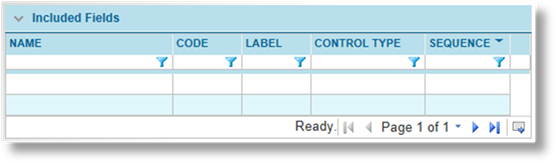
5. Select the fields to be included in the panel. The Fields grid displays all currently attached fields, and their settings.
|
|
Note: When configuring a panel as a tabbed grid, all fields included in Form panels within the associated Tab Workflow should be added to the current panel. |
|
Any fields included in Form panels within the associated Tab Workflow that are not included in the current panel will be displayed in the workflow, but will not be saved. | |
|
|
Fields that are not included in the associated Tab Workflow can be added to the current panel, but will not be displayed in the workflow. |
|
|
This does not apply to fields included in Grid or Premium Grid panels within the associated Tab Workflow, including child tab grids. Those fields are entirely configured within their respective panels. |
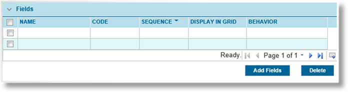
To remove fields from the panel, check the boxes next to all appropriate fields and click Delete.
Click Add Fields to add a new field, The Add Fields window opens.
Click a link in the Name column to view an existing field. The Edit Fields window opens.
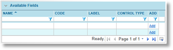
a) The Available Fields panel lists all fields that are available for use in the panel. The columns can be sorted and filtered to locate the necessary fields, then click Add for each one in the order they should appear in the panel. Each field is grayed out as it is selected.
b) Click Bulk Add to add all selected fields to the Included Fields list.
As each field is added, default sequence numbers are assigned in increments of ten and the configuration is saved. The sequence numbers can be changed manually later in the process.
c) When all fields have been added, click Close to close the window.
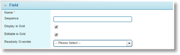
d) The Fields panel lists all fields currently included in the panel. To update details such as the sequence number and whether or not the field will be displayed in grids (for Grid and Premium Grid panels), click a link in the Name column. The Edit Field window opens.
|
Name |
Displays the name of the selected field. |
|
Sequence |
The assigned sequence number can be changed. |
|
|
Tip: It is advisable to leave gaps between the sequence numbers, such as 5, 10, 15. This allows new fields to be added to the list at a later date, inserted between existing fields. Otherwise, the sequence numbers of existing fields must be changed to allow for the new addition. |
|
Display in Grid |
This checkbox is only available for Grid and Premium Grid panels. When unchecked, the field will only be shown in the detail window or tab workflow when adding records. When checked, this field will be included in the grid, as well as the detail window or tab workflow. |
|
|
The first column displayed in the grid will contain links to open the detail window or tab workflow. For records that are missing a value in that first column, a View link will be displayed. |
|
Editable in Grid |
This option is available when Enable Editing in Grid is checked for the grid, Display in Grid is checked for the current field, and the current field type is supported for this feature. |
|
|
This feature allows the current field to be edited directly within the grid without having to open the detail window. Double-click a cell for an editable column to make changes. Clicking on another row or outside the grid saves the changes. |
|
|
The following field types are supported: Text Box, Textbox (Decimal), Textbox (Integer), Checkbox, and Drop Down. However, if the field configuration is set to Read-Only, this checkbox will not be available. |
|
|
Note that any field or panel override conditions will not be applied, but the Required setting in the field configuration will be enforced if it is enabled. In addition, data validations set for the grid will not be triggered, so any such validations should also be set for the parent page. |
|
Read-Only Override |
This option is available when Editable in Grid is checked and the current field is a Checkbox, Drop Down, Text Box, Textbox (Decimal) or Textbox (Integer). Another field in the panel can be chosen to make the current field read-only when the other field evaluates to True. The other field can be a Text Box, Label or Checkbox. |
|
|
This is useful when a Checkbox should be editable directly in the grid but read-only under certain conditions. |
|
|
Note: The system’s True/False evaluation of this feature is case-sensitive. The system will evaluate “True” as True, but evaluate “true” as False. When using a Text Box or Label, ensure that all values that should evaluate to True have a value of “True”, where T is capitalized. |
|
|
A Checkbox will evaluate to True when it is checked, and False when it is unchecked. |
e) Click Save & Close to save and close the window, or click Close to close the window without saving any changes.
f) On the Panel Management page, fields can be removed from the panel by checking the boxes for all fields to be removed, then click Delete.
6. By default, each panel is open, visible, and editable at all stages and statuses of the transaction or claim. The Panel Behavior Override is used to create rules that change the behavior based on a variety of options. The table lists all currently defined rules.
|
|
Tip: Overrides take effect when the page refreshes. Responsive Display of Panels, detailed in the Managing Screens section, causes panels to hide or appear immediately, and may be a useful alternative to overrides. |
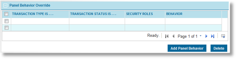
To delete override rules, check the boxes next to all appropriate rules and click Delete.
Click Add Panel Behavior to add a new override rule, or click a link in the Transaction Type Is column to view an existing rule. The Panel Behavior Override page opens.
a) Complete the necessary details to define the rule.
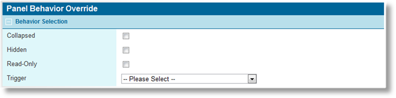
Select how the panel should behave under the defined circumstances.
|
Collapsed |
The panel starts out collapsed when the form is displayed. The user can still expand the panel to display the fields. |
|
Hidden |
The panel is not shown in the form, although it is still present for use in triggers, calculated fields, and generating documents. |
|
Read-Only |
The panel can be viewed, but cannot be edited. |
The Trigger option is used to assign a trigger to the rule. The rule is only applied if the trigger evaluates as true.
|
|
Notes: Use caution when creating override rules for panels that contain fields used in triggers. It can create circumstances where users trigger changes in a form that they cannot undo. |
|
When a user makes changes in a form that trigger an override rule, it does not occur immediately. The rule is applied when any action is taken that saves the form. | |
|
If a panel is hidden by a triggered override rule, all fields in that panel retain their current value. |
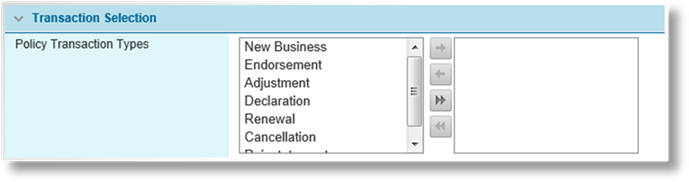
Select the type of transaction where the rule applies.
|
New Business |
The original version of a submission or policy. |
|
Endorsement |
A modification to a bound policy. |
|
Adjustment |
An adjustment to a bound policy. |
|
Declaration |
A periodical modification to a bound policy. |
|
Renewal |
A renewal for an expired policy. |
|
Cancellation |
A cancelled policy. |
|
Reinstatement |
A policy that was reinstated after being cancelled. |

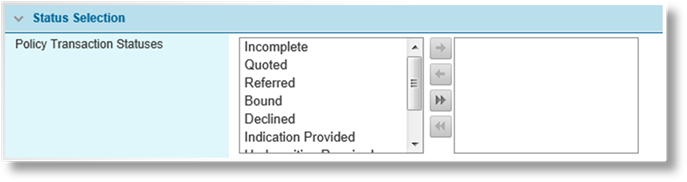
Select the status of submission or policy where the rule applies.
|
Incomplete |
A submission that has not yet had a quote calculated. |
|
Quoted |
A submission that has been quoted and is ready to be bound. |
|
Referred |
A submission that does not meet the requirements of the master cover and has been submitted to the insurance representatives for review. |
|
Bound |
A policy that has been bound. |
|
Declined |
A quote request or referral that has been declined. |
|
Indication Provided |
A preliminary quote has been issued, which cannot be bound. A full quote must still be requested, possibly requiring additional information. |
|
Underwriting Required |
A submission that does not meet the requirements of the master cover and must either be corrected or submitted to the insurance representatives for review. |
|
Payment Pending |
A submission that is awaiting payment before being bound. |
|
Lost |
A quote that has been marked as lost business. |

Select the types of user where the rule applies. The user viewing the form must have one or more of the selected security roles in order for the rule to be applied.
|
|
Note: At least one option must be selected in each category. For a rule to apply to all options in a category, all options must be selected. |
b) Click Add & New to save the rule and clear the form to add additional rules, click Add & Close to save the rule and return to the panel details, or click Close to return to the panel details without saving the rule.
7. When each field was created, default behavior was defined. The Field Behavior Override is used to create rules that change the behavior based on a variety of options. The table lists all currently defined rules. This option is not available when Tabs is selected as the Management Style.
|
|
Tip: Overrides take effect when the page refreshes. Responsive Display of Fields, detailed in the next step, causes fields to hide or appear immediately, and may be a useful alternative to overrides. |
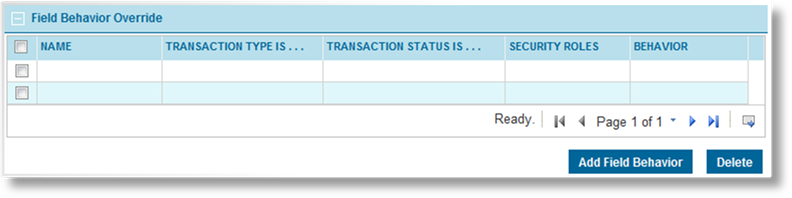
To delete override rules, check the boxes next to all appropriate rules and click Delete.
Click Add Field Behavior to add a new override rule, or click a link in the Name column to view an existing rule. The Field Behavior Override page opens.
a) Complete the necessary details to define the rule.
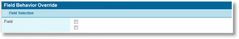
Select the fields where the rule applies. All required fields should be added to the panel before defining the rules. If any fields are added to the panel that should be included in an existing rule, the rule must be edited to select the new fields.
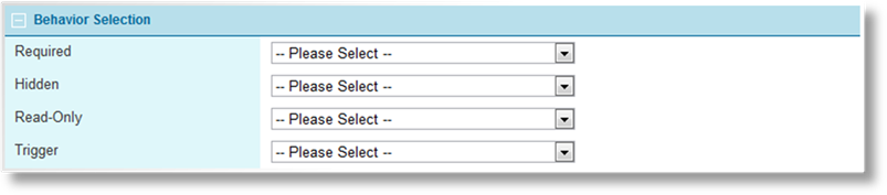
Select how the field should behave under the defined circumstances. For each option select Yes to apply the behavior, No to not apply it, or Not Applicable to indicate that this behavior should not be changed by this rule.
|
Required |
The field must be completed before the user can save the screen. |
|
Hidden |
The field is not shown in the form. |
|
Read-Only |
The field can be viewed, but cannot be edited. |
The Trigger option is used to assign a trigger to the rule. The rule is only applied if the trigger evaluates as true.
|
|
Notes: Use caution when creating override rules for fields that are used in triggers. It can create circumstances where users trigger changes in a form that they cannot undo. |
|
When a user makes changes in a form that trigger an override rule, it does not occur immediately. The rule is applied when any action is taken that saves the form. | |
|
If a field is hidden by a triggered override rule, it retains its current value. | |
|
When hiding a field included in a grid, the field is hidden when viewing the details page for an entry, but the column remains visible when viewing the grid itself. |

Select the type of transaction where the rule applies.
|
New Business |
The original version of a submission or policy. |
|
Endorsement |
A modification to a bound policy. |
|
Adjustment |
An adjustment to a bound policy. |
|
Declaration |
A periodical modification to a bound policy. |
|
Renewal |
A renewal for an expired policy. |
|
Cancellation |
A cancelled policy. |
|
Reinstatement |
A policy that was reinstated after being cancelled. |
Select the status of submission or policy where the rule applies.
|
Incomplete |
A submission that has not yet had a quote calculated. |
|
Quoted |
A submission that has been quoted and is ready to be bound. |
|
Referred |
A submission that does not meet the requirements of the master cover and has been submitted to the insurance representatives for review. |
|
Bound |
A policy that has been bound. |
|
Declined |
A quote request or referral that has been declined. |
|
Indication Provided |
A preliminary quote has been issued, which cannot be bound. A full quote must still be requested, possibly requiring additional information. |
|
Underwriting Required |
A submission that does not meet the requirements of the master cover and must either be corrected or submitted to the insurance representatives for review. |
|
Payment Pending |
A submission that is awaiting payment before being bound. |
|
Lost |
A quote that has been marked as lost business. |
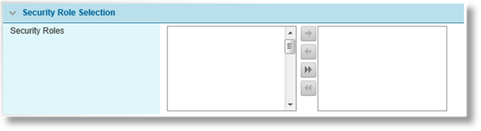
Select the types of user where the rule applies. The user viewing the form must have one or more of the selected security roles in order for the rule to be applied.
|
|
Note: At least one option must be selected in each category. For a rule to apply to all options in a category, all options must be selected. |
b) Click Add & New to save the rule and clear the form to add additional rules, click Add & Close to save the rule and return to the panel details, or click Close to return to the panel details without saving the rule.
8. In some cases, certain information will only be necessary under certain conditions. Responsive Display of Fields configurations allow fields to be hidden or displayed immediately when the user selects specific options in the panel.
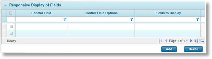
The Responsive Display of Fields panel is available when Window is selected as the Management Style.
To delete configurations, check the boxes next to all appropriate configurations and click Delete.
Click Add to add a new configuration, or click a link in the Control Field column to view an existing configuration. The Responsive Display of Fields window opens.
a) Complete the necessary information. Fields marked with a red asterisk * are required.
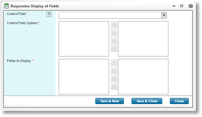
|
Control Field |
Select the field from the current panel that will control the display of the selected fields. Fields of type Checkbox, Radio Buttons, and Combo Box are available. |
|
Control Field Options |
This field is available when a Radio Buttons or Combo Box type field is selected as the Control Field. |
|
|
For a Radio Buttons control field, this will be an include/exclude field. Select which options will display the selected fields. A selected option cannot be used in more than one configuration. |
|
|
For a Combo Box control field, this will be a text field. Enter all values that will display the selected fields, separated by semi-colons. These should be the key values defined in the Data Source for the combo box. Spaces are permitted, but any spaces at the beginning or end of individual values will be ignored. A value cannot be used in more than one configuration. |
|
Fields to Display |
Select the fields from the current panel that will be affected by this configuration. When the checkbox is checked or one of the Control Field Options are selected, the fields will be displayed. Note that File Upload and Rich Text control types are unavailable for this feature. |
|
|
Note: If data exists in a field, either a default value or entered by the user, it will be maintained whether the field is displayed or hidden. |
b) Click Save & New to save the configuration and clear the form to add additional configurations, click Save & Close to save the configuration and close the window, or click Close to close the window without saving the configuration.
9. A standard grid is a stand-alone entity with unique fields, and can only be used once in any workflow. View Grids can be defined to share the data stored in the master grid. Each View Grid can contain all fields from the master grid, or a subset of those fields. All rules for displaying fields and data, including overrides, are inherited from the master. Any changes to data within a View Grid will update the master grid.
|
|
Notes: Grids configured as parent or child cannot be used as a master or view grid. The View Grids panel will not be shown. |
|
Only one grid from a single master/view configuration can be used on any one screen. Grids from separate configurations can be used on the same screen. | |
|
View Grids can be used in a workflow even if the master grid is not included. |
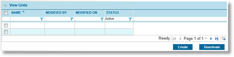
Click a link in the Name column to save the current page and open an existing View Grid. Click Create to save the current page and open the Panel Management page to create a new view grid. To deactivate view grids, check the boxes next to all appropriate grids and click Deactivate.
View grids are configured much like the master grid, although with reduced options. Some settings are inherited from the master grid, and all fields and overrides are included by default.
Any fields and overrides that should not apply to this view can be deleted by checking the boxes and clicking the Delete button. Any deleted fields can be added again, but only fields included in the master grid will be available.
10. The Field Assignments panel is available for Grids and Premium Grids.
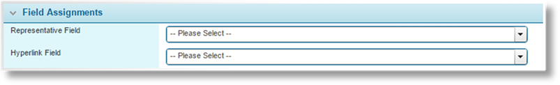
The Field Assignments panel is used to assign certain fields to special functionality within the grid.
|
Representative Field |
In some cases, the system will need to display an identifier for a single record out of the context of the grid itself. This identifier may be displayed as static text, or a link to the record. |
|
|
Select the field to be used for the identifier text. Enter three or more characters to locate the appropriate field. For best results, the selected field should contain data that clearly identifies the record. In instances where the selected field is blank and a link must be available, a View link will be displayed instead. Fields of type Label, Textbox, Textbox (Decimal), Textbox (Email), and Textbox (Integer) are available. |
|
Hyperlink Field |
A field in the grid can be selected to supply the links to specific pages within the workflow. Fields of type Label and Textbox are available. When a user clicks on a grid row’s hyperlink, the user will be navigated to the page specified in the row’s Hyperlink Field. |
|
|
Note that using this feature disables the Add and Export / Import features, as well as the ability to open a detail window by clicking a link in the first column. The grid can only be populated by an integration configuration. Once populated, certain fields can be edited directly in the grid if configured with the Editable in Grid setting. |

|
Active |
Marks the panel as active and available for use. If unchecked, the panel remains linked to any existing forms, but cannot be used for new forms. |
|
Created By |
Identifies the date and time the panel was created, and the user who created it. |
|
Last Modified By |
Identifies the last date and time the panel was changed, and the user who made the changes. |
11. Click Add to save the panel but remain on the page, click Add & Close to save the panel and return to the panels list, or click Close to return to the panels list without saving the panel.
1. In the main menu, select Product Design, then select Workflow Configurations, then Panels. A list of all available panels is displayed.

Some columns have been hidden.
|
|
Tip: By default, only Active panels are displayed. Clear the filter in the Status column to view all panels. |
2. Click a link in the Name column to view the panel details. If there are a large number of available panels, see the Using Grids section for help on finding the appropriate panel.
3. See the section on Creating a New Panel for a detailed description of the fields. All fields may be edited, if necessary, except for the System Reference name and Control Type.
4. Click Save to save any changes and remain on the page, click Save & Close to save and return to the panels list, or click Close to return to the panels list without saving any changes.
Once created, a panel cannot be deleted. It can be deactivated, which leaves it linked to any existing forms, but prevents it from being used for new forms.
1. In the main menu, select Product Design, then select Workflow Configurations, then Panels. A list of all available panels is displayed.
Some columns have been hidden.
|
|
Tip: By default, only Active panels are displayed. Clear the filter in the Status column to view all panels. |
2. Locate the panel or panels to be deactivated. If there are a large number of available panels, see the Using Grids section for help on finding the appropriate panels.
3. Check the boxes for all panels to be deactivated.
4. Click Deactivate, then confirm the deactivation when prompted to do so. All selected panels are deactivated. If the panels list is still defaulted to only show active panels, they disappear from the list.
|
|
Tip: Individual panels can also be deactivated or reactivated directly through the panel record. See the section on Viewing and Modifying a Panel for details. |

 in the panel header.