Many grids exist throughout the Bridge system, mostly preconfigured with set (but customizable) columns. Within the submission form, however, all fields and grids are designed and built to collect or display information specific to that workflow. These grids may be a single level or may be "Parent" grids with "Child" grids associated to each entry. Managing data within a grid may be a single set of fields that open in a window, or may be a series of tabbed screens that fill the main screen.
A grid may have one or more child grids, which can be used to provide data specific to the selected row in the parent grid. When a row is selected in a parent grid, any child grids will be displayed directly below the parent. The content of each child grid will be refreshed when selecting a different row in the parent.
Data can be entered into a child grid in the same way as the parent, by clicking Add or Export / Import (if enabled). When data has been added to a child for one row in the parent, simply select a new row in the parent to display the child for that row and enter more data. The checkbox column and Delete button are not currently in use.
If multiple child grids exist for a parent, they will all be displayed in order. Child grids may have child grids of their own, which will be displayed directly below their parent, pushing down any other grids that were below the parent.
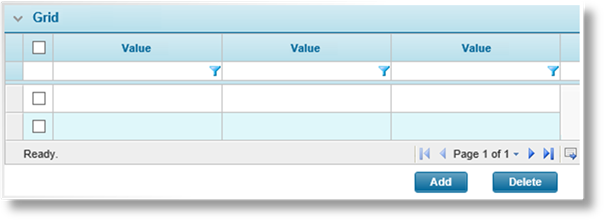
Click Add to add a new entry to the grid, or click a link in the first column of the grid to edit an existing entry. A detail window may open with a single panel of data, detailed in this section, or a series of tabbed screens may open in place of the current workflow, detailed Here.
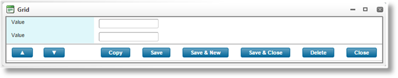
Fill in any necessary fields, then select an action.
|
▲ / ▼ (previous row / next row) |
Available once the record has been saved. Navigates to the previous or next record in the grid without saving any changes. |
|
Copy |
If enabled, this option is available once the record has been saved. This creates a copy of the current record, and may include associated records in child grids depending on the configuration of the child grids. The new record is saved upon copy, and opened immediately for editing. |
|
|
Note that unsaved changes to the current record will not be copied. Since the new record is opened immediately, any unsaved changes are lost. |
|
Save |
Saves the current record. |
|
Save & New |
Saves the current record and clears the form to add another record. |
|
Save & Close |
Saves the current record and closes the detail window. |
|
Delete |
Available once the record has been saved. Deletes the current record, as well as any child data that may be associated with it. |
|
Close |
Closes the detail window without saving the changes. |
|
|
Note: When saving, the content may be validated according to rules defined in the product. An error message is shown at the top of the form, detailing what must be changed before proceeding. Make any necessary corrections and save again to validate the information. |
Click Add to add a new entry to the grid or click a link in the first column of the grid to edit an existing entry. A series of tabbed screens may open in place of the current workflow, detailed in this section, or a detail window may open with a single panel of data, detailed Here.
The new record is saved immediately when the screen opens.
The Grid Hierarchy widget appears to the left of the screen.
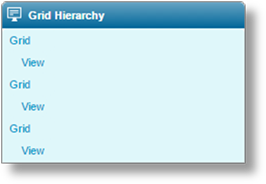
The Grid Hierarchy widget displays the name of the current grid and an identifier for the current record (indented) within that grid. If the identifier for the current record is blank or contains data that cannot be displayed in the widget, View will be displayed instead. If you navigate deeper into a multi-level grid, the grid name and current record will be displayed for each parent grid as well.
The widget can be used to navigate to higher levels of the hierarchy. Clicking a grid name will go to the screen containing that grid. If the grid appears multiple times in a workflow, this will go to the first instance of that grid. The exception to this is when using the link to the top-level grid, which will go to the instance of the grid that was used to enter the tab workflow.
Clicking a record will go to the first screen of that record.
Fill in any necessary fields. Click the tabs at the top of the screen to navigate between screens, which will save any changes.
When done, select an action.


|
▲ / ▼ (previous row / next row) |
Navigates to the previous or next record in the grid. This does not save the current screen or tab. If any changes have been made, a message appears warning that changes will be lost. |
|
|
The system navigates to the same tab in the previous or next row. If that tab is unavailable, it will navigate to the first tab of the workflow. |
|
Copy |
If enabled, this option is available once the record has been saved. This creates a copy of the current record, and may include associated records in child grids depending on the configuration of the child grids. The new record is saved upon copy, and opened immediately for editing. |
|
|
Note that unsaved changes to the current record will not be copied. Since the new record is opened immediately, any unsaved changes are lost. |
|
Save |
Saves the current record. |
|
Save & New |
Saves the current record and opens a new blank form to create a new record. |
|
Save & Close |
Saves the current record and returns to the submission form or the parent grid, depending on how the current record was accessed. |
|
Delete |
Deletes the current record, as well as any child data that may be associated with it, and returns to the submission form. |
|
Close |
Returns to the submission form or the parent grid, depending on how the current record was accessed, without saving the changes. |
|
Previous |
Moves to the previous tab in the workflow. This does not save the current screen or tab. If any changes have been made, a message appears warning that changes will be lost. |
|
Next |
Saves the current tab and moves to the next tab in the workflow. |
|
|
Note: When saving, the content may be validated according to rules defined in the product. An error message is shown at the top of the form, detailing what must be changed before proceeding. Make any necessary corrections and save again to validate the information. |
A Premium Grid is similar to a standard grid, but includes additional columns to display the calculated premium. At least one field in the premium grid should be a rate driver field, which is a field used in the calculation of premium. When quotes have been calculated and a quote has been selected (if necessary), the gross premium is calculated for each row in the grid.
Two extra columns are included in the grid.
|
Transaction Premium |
Displays the calculated premium for the current transaction. |
|
Term Premium |
Displays the adjusted premium for the entire current term. This column is not displayed for New Business and Renewal transactions. |
Premium grids support child grids. If the child grid is also a premium grid, the premiums are calculated for each row in the child as well, and rolled up into the Transaction Premium and Term Premium columns in the parent grid. This extends through multiple branches and levels of child grids. Note that, while a standard grid as a child can have either a standard grid or a premium grid for a parent, a premium grid child can only have a premium grid for a parent.
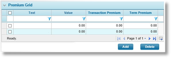
Like the standard grid, clicking Add opens a detail window or tabbed screens to add new rows, and clicking a link in the first column opens the detail window or tabbed screens to view that row. The checkbox column and Delete button are not currently in use.
Once a quote has been calculated and selected, viewing an existing row includes a breakdown of the premium types included in the calculated premium.
For a detail window, the premium breakdown is displayed in a grid within the window.
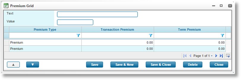
For each Premium Type listed, the Transaction Premium and Term Premium columns display the amount calculated for that type, including any premium from child premium grids.
For a tabbed grid, the premium breakdown is displayed in the Row Item Premium widget to the right of the tab workflow.
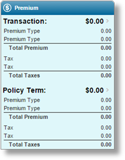
The widget header displays Row Item Premium when adding a row. When viewing a saved row, the Representative Field value for the current row is displayed.
The two sections, Transaction and Policy Term, are collapsed by default. Click on a section to expand it and see the details. For each section, the widget provides the totals and sum for each premium type, as well as the totals and sum of each tax or fee.
|
|
Note: Adding new rows or editing existing rows does not automatically update the calculated premiums. The quotes must be recalculated and a new quote selected to update the grid or widget. |
