
Note: Not all features are enabled for all grids.
Grids are used throughout the system to present data in a table format. Many grids can be filtered, sorted, and reorganized as needed. Adding or editing data is handled through detail pages that will open as a window or a tabbed set of screens.
|
|
Note: Not all features are enabled for all grids. |
While some grids may only contain a small amount of data, easy to manage on its own, other grids may have multiple pages of detailed information that requires specific control. This is achieved using the advanced filter and sorting options of the grid.
The filter option  can be used to filter the data
in a column, displaying entries that match or do not match a specified option or
text.
can be used to filter the data
in a column, displaying entries that match or do not match a specified option or
text.
|
|
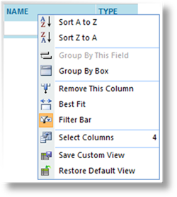
Tip: If the filter options are not shown, right click any column header and select Filter Bar from the menu. |
1.
Click the filter icon to
open the filter menu. The available options depend on the type of data in
the column.
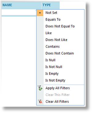
|
Not Set |
No filter is applied to the column. |
|
Greater Than |
For dates and numerical values, displays entries that exceed the filter value. |
|
Greater Than or Equal To |
For dates and numerical values, displays entries that match or exceed the filter value. |
|
Less Than or Equal To |
For dates and numerical values, displays entries that match or are less than the filter value. |
|
Less Than |
For dates and numerical values, displays entries that are less than the filter value. |
|
Equals To |
Only displays entries that match the filter text exactly. |
|
Does Not Equal To |
Only displays entries that do not match the filter text exactly. |
|
Like |
Displays all entries that start with the filter text. |
|
Does Not Like |
Displays all entries that do not start with the filter text. |
|
Contains |
Displays all entries that contain the filter text. |
|
Does Not Contain |
Displays all entries that do not contain the filter text. |
|
Is Null |
Displays entries that do not include the field being filtered. |
|
Is Not Null |
Displays entries that include the field being filtered, even if that field is empty. |
|
Is Empty |
Displays entries that include the field being filtered, but the field is empty. |
|
Is Not Empty |
Displays entries that contain any value in this column. |
|
Apply All Filters |
If the data has been changed, this option refreshes the filters. |
|
Clear This Filter |
Clears the filter text and sets the filter type to Not Set. |
|
Clear All Filters |
Clears all filter text on the current page and sets all filter types to Not Set. |
2.
Click in the space to the left of the filter icon to enter the filter
text. Results are displayed based on the chosen filter type in relation to
this text. If no filter has been selected, a default filter is applied,
suitable to the type of data in the column. If the column is for dates,
then a calendar lookup can be opened using the down arrow icon  .
.
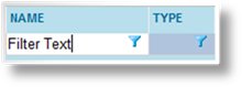
3. Press Enter when the filter text is in place, and the filter is applied.
4. The filter text and filter type can be modified as needed to locate the required entries.
Clicking the header of a column
once sorts the data in ascending order, marked by an up arrow  . Clicking the column again sorts by
descending order, marked by a down arrow
. Clicking the column again sorts by
descending order, marked by a down arrow  . Clicking a third time removes the
sorting, restoring the data to its default order.
. Clicking a third time removes the
sorting, restoring the data to its default order.
The sorting options can also be reached by right-clicking any column header.
|
Sort A to Z |
Sorts the column in ascending order. |
|
Sort Z to A |
Sorts the column in descending order. |
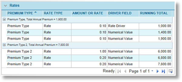
In addition to sorting, some grids (such as the Rates breakdown in the Quote Report) allow grouping.
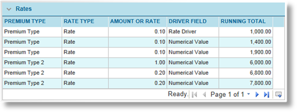
The example above displays a standard grid layout, with data sorted on one column and all entries listed together.
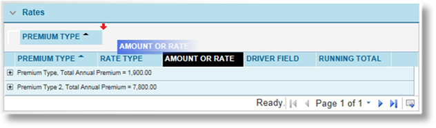
With grouping applied to the
Premium Type column, a group is created for each unique entry in that
column. All data for each entry is listed together. Sorting can be
applied independently of the grouping, and each group can be collapsed or
expanded using the  and
and
 icons respectively.
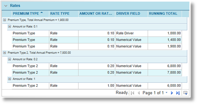
While the first grouping is in place, additional levels of grouping can be applied to other columns. Each column selected for grouping becomes a sub-group of the existing groups.
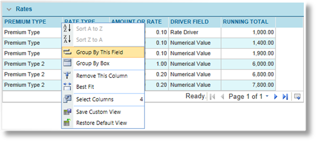
The most direct way to group by a field is to right-click the header and select Group By This Field. The groups are divided, and additional columns can be added through the same means.
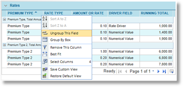
To remove a column from the grid, right-click on the column header and select Ungroup This Field. If there are multiple groupings, they do not need to be removed in order.
In some cases, the grouped column is removed from the grid, preventing it from being removed by this method. Under this condition, the Group By Box should be used (see below).
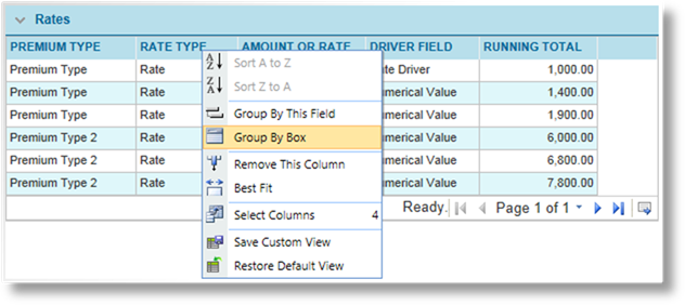
To activate the Group By Box, right-click any column header and select Group By Box. A space appears between the panel header and the column headers.
Columns can be dragged in and out of this area defining the primary group and any additional groups.
