In addition to branding portals with corporate colors and logos, a custom domain can be assigned to a default portal. While navigating the system, your users will see the custom domain as the root of the URL for each page, and emails sent from the system will be sent from the selected domain.
The first step will be to purchase the domain (if it is not already owned), and register the domain to your Bridge licensee site. Please contact your Oceanwide Account Representative for the details necessary to complete the registration.
Note: A domain can only be registered to one website, so it will not be possible to use your company's corporate domain. A unique domain will need to be registered, although it may be a variation of your corporate domain.
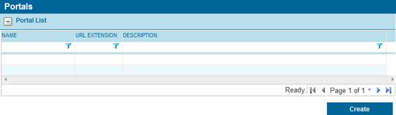
1. In the Main Menu, select Portals. The Portal List page opens with a list of all available portals.
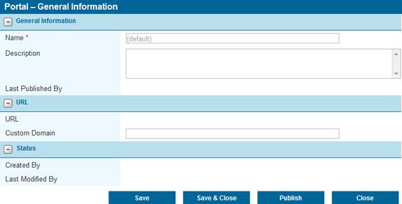
2. Click the (default) link in the Name column to view the default portal. The Portal - General Information page opens.
|
Name |
Displays the name of the portal. For the default portal, the name cannot be changed. |
|
Description |
Enter a description that will appear on the portals list. |
|
Last Published By |
This field displays the name of the user who last published this portal, plus the date and time it was published. |
|
URL |
This field displays the internal URL of the portal. This is the direct access to the portal, which will be used by all users if a custom domain is not defined. Even if a custom domain has been defined, this URL will remain functional. This can be used as an emergency access option if there are any problems with the custom domain. |
|
Note: Using the internal URL will bypass the custom domain. When navigating the system using this option, the internal URL will be shown as the address of each page, instead of the custom domain. This will also affect emails sent from the system while logged into the internal URL. | |
|
Custom Domain |
Once the custom domain has been registered, enter the domain in this field. The domain name should include the name and extension, such as "oceanwide.com", without any server identifiers or protocol information (www, https, etc.), or any subfolders (/login, /home, etc.). The domain entered in this field must also match the registered domain exactly. |
|
Created By |
This field displays the name of the user who created this portal, plus the date and time it was created. |
|
Last Modified |
This field displays the name of the last user to make changes to this portal, plus the date and time of the changes. |
3. Click Save to save the portal but remain on the page, click Save & Close to save the portal and return to the Portal List table, or click Close to return to the Portal List table without saving the portal.
Note: While this page can be saved, as well as all the other pages in the Portal sub-menu, the changes will not be applied to the live website until the portal is published. The Last Published By field can be used to determine if recently saved changes have been published.
4. Additional configuration options can be applied to the default portal before publishing. The other features are available under the Portals menu, and are described in detail in the sections below.
5. Once all changes have been made to the portal, click Publish in the General Information page to apply all saved changes to the live website. Any changes that have not been saved will not be published.
Once a custom domain has been registered and assigned to the default portal, any additional portals (see below) can be accessed at that domain with the appropriate sub-folders. To confirm the exact URL to access additional portals, check the URL field in each additional portal record.
While the default portal is automatically created when a new licensee site is set up, you can add additional portals with different settings, color schemes, and branding. These additional portals will be accessed with a URL Extension assigned to the portal.
1. In the Main Menu, select Portals. The Portal List page opens with a list of all available portals.
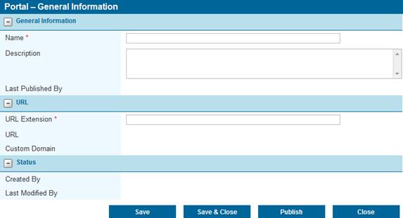
2. Click a link in the Name column to view an existing portal. The Portal - General Information page opens, and additional options will be listed under the Portals header in the main menu. The General Information page contains basic information on the portal.
|
Name |
Enter the name of the portal. This name will be used in the portal list. |
|
Description |
Enter a description that will appear on the portals list. |
|
Last Published By |
Once the portal has been published for the first time, this field will display the name of the user who last published this portal, plus the date and time it was published. |
|
URL Extension |
Additional portals are accessed through extensions to the internal URL or custom domain. Enter the name of the extension, exactly as it should appear in the URL. Only numbers and letters are allowed, with no spaces or special characters. |
|
Examples: •If the URL Extension is "Cars" and a Custom Domain has not been specified, the URL would resemble: https://licensee.oceanwidebridge.com/Cars •If the URL Extension is "Ocean" and the Custom Domain is "insurance.com", the URL would resemble: https://insurance.com/Ocean
| |
|
URL |
This field displays the internal URL of the portal, plus the URL Extension. This is the direct access to the portal, which will be used by all users if a custom domain is not defined. Even if a custom domain has been defined, this URL will remain functional. This can be used as an emergency access option if there are any problems with the custom domain. |
|
Note: Using the internal URL will bypass the custom domain. When navigating the system using this option, the internal URL will be shown as the address of each page, instead of the custom domain. This will also affect emails sent from the system while logged into the internal URL. | |
|
Custom Domain |
If a custom domain has been defined for the default portal, this field will display the custom URL of the portal, including the URL Extension. |
|
Created By |
Once the portal has been saved, this field will display the name of the user who created it, plus the date and time it was created. |
|
Last Modified |
Once the portal has been saved, this field will display the name of the last user to make changes, plus the date and time of the changes. |
3. Click Save to save the portal but remain on the page, click Save & Close to save the portal and return to the Portal List table, or click Close to return to the Portal List table without saving the portal.
Notes:
When creating a new link, the buttons will be displayed as Add, Add & Close, and Close. However, they will function exactly the same as the Save buttons.
Saving the portal does not make a new portal available for use, and does not update an existing portal with the changes that have been made. A portal must be Published to make the new settings available for use.
4. Additional configuration options can be applied to the portal before publishing. The other features are available under the Portals menu, and are described in detail in the sections below.
5. Once all changes have been made to the portal, click Publish to apply all saved changes to the live website. Any changes that have not been saved will not be published.
When creating a new portal for a specific product or distributor, or when modifying the default portal for your company's use, the color scheme can be customized to match company branding or color design preferences.
1. In the Main Menu, select Portals. The Portal List page opens with a list of all available portals.
2. Click a link in the Name column to view a portal. The Portal - General Information page opens, and additional options will be listed under the Portals header in the main menu.
3. Select Colors in the Portals submenu. The Colors page opens.
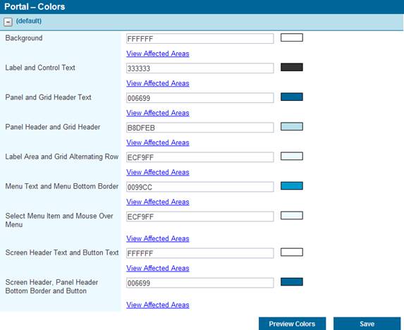
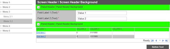
4. A series of groups allow individual colors to be assigned to multiple related elements. Clicking the View Affected Areas link for any group will open a window with a sample screen, with green highlighting on the screen elements that are included in that group.
For example, below is the sample for Panel Header and Grid Header.
5. As colors are changed, the Preview Colors button can be used to assemble a preview image containing all of the selected colors.
6. Once the colors have been defined for all groups, click Save. The saved changes will be applied when the portal is published from the General Information page of the portal.
All newly created portals will begin with default content for the logon page, the self-registration page, and the welcome page, as well as the headers and footers of each page in the system. These areas can now be redesigned to suit your needs, allowing custom content including fully formatted text, pictures, and links.
1. In the Main Menu, select Portals. The Portal List page opens with a list of all available portals.
2. Click a link in the Name column to view an existing portal. The Portal - General Information page opens, and additional options will be listed under the Portals header in the main menu.
3. Select Contents in the Portals submenu. The Contents page opens.
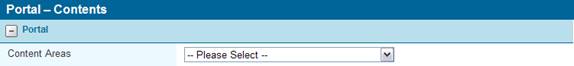
4. Multiple areas of the system can be customized from this page. In the Content Areas drop-down, select the area that you want to customize.
|
Footer |
The banner area at the bottom of the page. This section does not have default content. |
|
Header |
The banner area at the top of the page. |
|
Logon Page |
The page containing the logon box. |
|
Self-Registration Page |
If activated, this page will allow users to create their own account to access the system. |
|
Welcome Page |
The first page the user sees after logging in. |
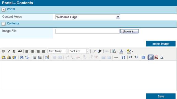
5. The main window is where the content will be prepared. Default content will be included for any new portals, and can be modified to suit your needs or entirely replaced. Content can be built directly in the window using a variety of common editing tools presented in the toolbar, or it can be pasted in as Text or Rich Text.
Note: Text pasted into the editor may undergo some minor formatting changes. The formatting tools can be used to correct the differences.
The available space varies according to the Content Area.
•Welcome Page – The welcome page will expand to match the content.
•Header - The header section is 950 pixels wide, and 80 pixels high. Any content that extends beyond that area will be cut off when viewing the header.
•Footer - The footer section is 950 pixels wide, and 100 pixels high. Any content that extends beyond that area will be cut off when viewing the footer.
•Logon Page - The logon content section has a maximum width of 960 pixels, with any content exceeding this space being cut off. The vertical space is unlimited, with the page expanding to fit the content.
•Self-Registration Page - The registration content section has a maximum width of 960 pixels, with any content exceeding this space being cut off. The vertical space is unlimited, with the page expanding to fit the content.
6. To add images to the page, click the Browse button to open a standard file selection window. The system supports image files of GIF, JPG, PNG, and BMP formats. Select the file to be included and click Open. The full path and filename will be displayed in the Image File field.
7. Click Insert Image to add the image at the end of the current content. The image can then be moved by clicking on it with the mouse and dragging it to the appropriate location in the content. The system does not limit the dimensions or file size of the image, however very large files will take longer to load each time a user accesses the page.
8. The content can be saved at any time by clicking Save.
Note: Moving between content areas does not automatically save the content of the current area. Click the Save button to save the content before navigating away from the page.
9. Once the content is ready, the saved changes will be applied when the portal is published from the General Information page of the portal.
Known Issues: When a hyperlink is applied to text that has been underlined, the link will appear as Strike Through text. The Strike Through error will also occur when using the default font family at size 5 (18pt). These issues will be corrected.
While the new portal customization features allow custom content to be included on several pages, the Home page can now be customized by each individual user. The Welcome Page content can be hidden, and grids can be added to provide quick access to submissions and policies, as well as notes and follow ups.
The settings are selected in the Profile page. The Home Page Preferences panel has been added.

|
Display Welcome Page Content |
Selects whether or not the greetings and instructions will be displayed. |
|
Note: The Welcome Page content may have been customized to provide important information or instructions. Please review the content before deactivating it. | |
|
Display Submissions/Policies Panel |
Selects whether or not to display the grid containing all available submissions and policies. |
|
Display Notes & Follow Ups Panel |
Selects whether or not to display the grid containing any notes or follow ups requiring action. |
|
Note: The submission and notes options will only be available to users with the necessary rights to view submissions and notes, respectively. | |
The Home page will be the first page opened when you log into the system, and can be accessed directly by selecting Home in the main menu.
If active, the Submission/Policy List will display all available submissions and policies.
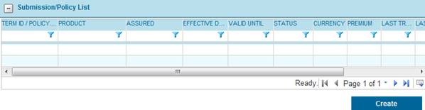
Click a link in the Term ID / Policy No. column to view an existing submission or policy, or click Create to begin the process of creating a new submission.
If active, the Notes & Follow Ups grid will display any notes that are due for follow up. By default, only notes with scheduled follow ups that are due or past-due will be displayed. Clearing the filters will display all available notes.
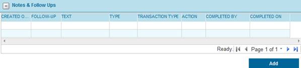
Click a link in the Created On column to view a note, or click Add to create a new note.
In the event that you want to direct your users to other websites, links can be added to individual portals, and will appear in the main menu on the left side of the page.
The links will be included in the main menu between the Help and Log Off menu items, and can be set to show individually or in a sub-menu. Clicking one of these links will open a new browser window with the selected URL.
1. In the Main Menu, select Portals. The Portal List page opens with a list of all available portals.
2. Click a link in the Name column to view a portal. The Portal - General Information page opens, and additional options will be listed under the Portals header in the main menu.
3. Select Custom Menu Items in the Portals submenu. The Custom Menu Items page opens.
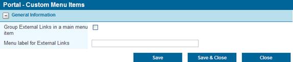
|
Group External Links in a main menu item |
Check this box to display all external links in a sub-menu that will expand when the Menu Label (see below) is clicked. If this box is not checked, all links will be displayed directly in the main menu. |
|
Menu label for External Links |
If the links will be grouped under a sub-menu, enter the name of the sub-menu here, as it should appear in the main menu. |
4. Click Save to save the settings but remain on the page, click Save & Close to save the settings and return to the General Information page for the current portal, or click Close to return to the General Information page without saving the settings.
5. Select External Links in the Portals submenu. The External Link List page opens with a list of all links attached to the current portal.
Note: By default, only Active links will be displayed. Clear the filter in the Status column to view all links.
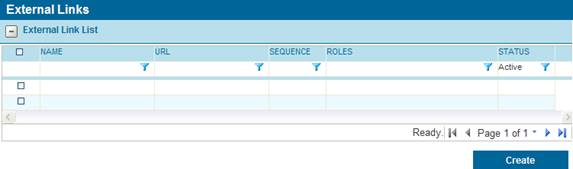
6. Click a link in the Name column to view an existing link, or click Create to add a new link. The External Links page opens.
Checking the box next to a link and clicking Deactivate will make the link inactive, and it will not appear in the menu unless the filter is cleared from the Status column.
7. Select the settings for the link in the External Links page.
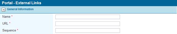
Name - Enter the name of the link as it should appear in the menu.
URL - Enter the full URL of the website the link will open. This should include the protocol ("http://" or "https://", for example). If you are unsure of the full address of the site, you can visit the site directly and copy the URL from the Address bar in the browser.
Sequence - Enter a Sequence number. This will determine the link's position in the menu, with lower numbers appearing first.
Notes:
It is advisable to leave gaps between the sequence numbers, such as 5, 10, 15. This allows new items to be added to the list at a later date, inserted between existing items. Otherwise, the sequence numbers of existing items will need to be changed to allow for the new addition.
If multiple items are given the same sequence number, they will be grouped together and sorted alphabetically.
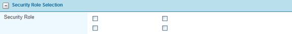
Security Role - Access to the link can be restricted according to security roles. Check all roles that should have access to the link, and only users who have at least one of the selected roles will be able to see and use the link. Check all roles to make the link available to all users.
The Status panel will be displayed once a link has been saved, or when viewing an existing link.
Active - This checkbox controls if the link will be displayed and available for use by users with the appropriate security roles. If unchecked, the link will not be available to any users, and will not be shown in the External Link List unless the filter is cleared in the Status column.
Created By - Identifies the date and time the link was created, and the user who created it.
Last Modified By - Identifies the last date and time the link was changed, and the user who made the changes.
8. Click Save to save the link but remain on the page, click Save & Close to save the link and return to the links list table, or click Close to return to the links list table without saving the link.
Note: When creating a new link, the buttons will be displayed as Add, Add & Close, and Close. However, they will function exactly the same as the Save buttons.
9. Once all settings and links are ready, the saved changes will be applied when the portal is published from the General Information page of the portal.
A new option has been introduced to default the effective date of newly created endorsements to the same effective date as the source policy term.
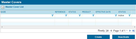
1. In the Main Menu, select Master Covers. The Master Cover List page opens with a list of all available Master Covers.
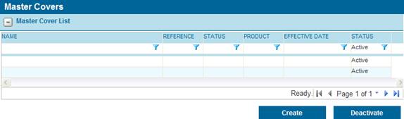
2. Click a link in the Name column to view an existing Master Cover. The Master Cover - General Information page opens, and additional options will be listed under the Master Covers header in the main menu.
Note: This feature cannot be edited if the Master Cover is currently Live. It will need to be in Draft or Test mode.
3. Select Policy Settings in the Master Covers submenu. The Policy Settings page opens.
4. The Default Endorsements to Term Effective Date checkbox has been added to the Effective Coverage Period Settings panel.
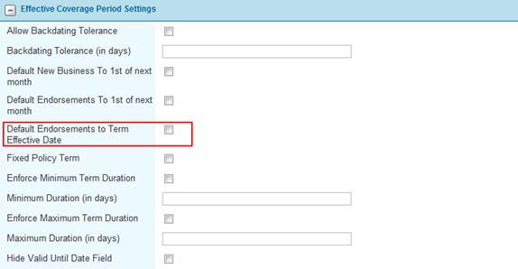
5. Check the box to activate this option. Complete any other required settings, and click Save to save the changes.
Note: This feature cannot be checked at the same time as Default Endorsements To 1st of next month. Checking either option will automatically uncheck the other.
When any new endorsement is created for a policy under this Master Cover, the effective date will default to the same effective date as the policy or renewal transaction that is being endorsed. The user may then modify the effective date, if necessary.
In instances where the coverage period panel is not required or should not be available to certain users, conditions can be set to hide the panel. The conditions are based on the type of transaction, the status of the submission or policy, and the security role of the user.
1. In the Main Menu, select Master Covers. The Master Cover List page opens with a list of all available Master Covers.

2. Click a link in the Name column to view an existing Master Cover. The Master Cover - General Information page opens, and additional options will be listed under the Master Covers header in the main menu.
3. Select Policy Settings in the Master Covers submenu. The Policy Settings page opens.
4. The new access settings are included in the new panel, Hide Effective Coverage Period Panel for following Transaction Types, Statuses and Security Roles.
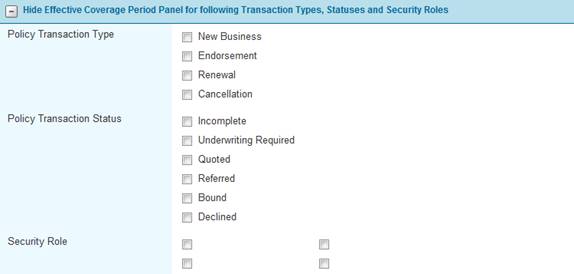
Select the type of transaction where the panel will be hidden.
|
New Business |
The original version of a submission or policy. |
|
Endorsement |
A modification to a bound policy. |
|
Renewal |
A renewal for an expired policy. |
|
Cancellation |
A cancelled policy. |
Select the status of submission or policy where the panel will be hidden.
|
Incomplete |
A submission that has not yet been submitted for quote, or is open for editing. |
|
Quoted |
A submission that has been quoted and is ready to be bound. |
|
Referred |
A submission that does not meet the requirements of the master cover and must be reviewed by an insurance representative. |
|
Bound |
A policy that has been bound. |
|
Declined |
A quote request or referral that has been declined. |
|
Underwriting Required |
A submission that does not meet the requirements of the master cover and must be reviewed by the Insurer. |
Select the types of user the rule will apply to. If the user has one or more of the selected Security Roles, the rule will be applied.
Note: If all boxes are left unchecked in any of the three sections, the panel will always be visible. To include all types, statuses, or roles in the condition, check all boxes for the appropriate section.
5. Complete any other required settings, and click Save to save the changes.
Previously, any tables included in generated documents would include every row in that table. This feature has been enhanced to allow triggers that define which rows to include in the generated document.
Creating or modifying document templates requires the installation of the most recent version of the Word Ribbon and the most recent download of the Word Ribbon data from the Bridge system. For detailed instructions on managing document templates and the Word Ribbon, please see the supplemental materials available from your Oceanwide Bridge Representative.
Once the repeating section of the document has been set up, either as a table or as text, the trigger can be added anywhere between the beginning and end of the table markers.
For example, the repeater for a grid named “Table1” containing the fields “Field1”, “Field2”, and “Field3” would show as follows (no formatting is included):
<<TableStart:Table1>> <<Field1>> <<Field2>> <<Field3>> <<TableEnd:Table1>>
The values of each of the three fields would be displayed for each entry in the table.
To add a trigger:
1. place the cursor at some point between the TableStart and TableEnd markers, although not within a field marker.
2. Under the Select Fields menu of the Word Ribbon, select Repeater Triggers.
Note: Document Triggers will not work within a repeater. You must select Repeater Triggers. Document Triggers will still work within the rest of the document.
3. Select the trigger to be used for the table.
The trigger marker will be inserted at the cursor location, and will be identified as a Repeater Trigger. For example:
<<TableStart:Table1>> <<Field1>> <<Field2>> <<Field3>> <<RepeaterTrigger_Trigger1>> <<TableEnd:Table1>>
With this configuration, when the document is generated the system will move through the table one record at a time, checking the trigger for each row. Only records that meet the requirements of the trigger (where the trigger evaluates as True) will be included in the document.
Notes: A nested trigger can be used, meaning a trigger that includes other triggers within its conditions.
Only one trigger can be used for each grid, within the same document. There are two options for resolving this limitation:
Creating two identical grids with different names, but containing the same fields. Each grid could be used for one table within the same document.
Create two or more linked documents that will be merged when generated. Each of the documents can have one instance of a grid with different triggers.
Field Override Behaviors are sets of rules determining whether or not a field will be displayed for a particular combination of user, transaction type, and submission/policy status.
Triggers can now be included in those rules, using the values of one or more fields to determine if that behavior will be applied.
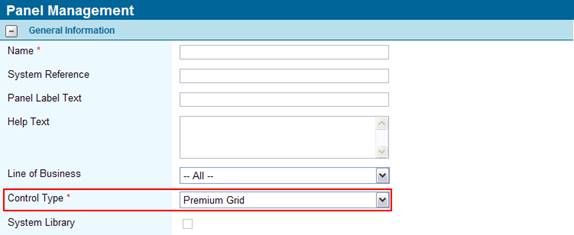
1. In the Main Menu, click Product Design to expand the product design sub-menu, then select the Panels option. The Panels list page opens with a list of all available panels.
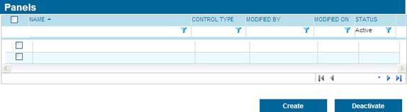
2. Click a link in the Name column to view an existing panel. The Panel Management - General Information page opens.
3. The Field Behavior Override panel lists all override rules currently set for fields within this panel.
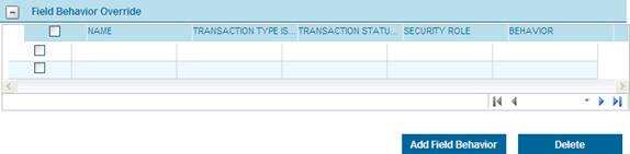
4. Click a link in the Name column to view the override rule. The Field Behavior Override page opens. The Trigger field has been added to the Behavior Selection panel.
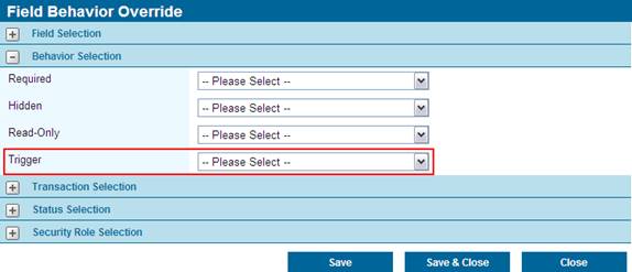
5. All triggers will be available, both Universal triggers and triggers associated to Workflows. Only one trigger can be selected per override rule, however that trigger may be nested, meaning that the trigger conditions include other triggers.
6. Click Save to save the rule but remain on the page, click Save & Close to save the rule and return to the Panel Management page, or click Close to return to the Panel Management page without saving the rule.
7. The saved changes will be applied when the workflow is published.
Notes: Use caution when creating override rules for fields that are used in triggers. It can create circumstances where users will trigger changes in a form that they cannot undo.
When a user makes changes in a form that will trigger an override rule, it will not occur immediately. The rule will be applied when the form is saved.
If a field is hidden by a triggered override rule, it will retain its current value.
When hiding a field included in a grid, the field will be hidden when viewing the details page for an entry, but the column will remain visible when viewing the grid itself.
A new type of grid has been introduced, allowing rates to be calculated and displayed for each entry.
When viewing the grid, two columns will be automatically added, displaying the premiums for the current transaction and the term.
Preparing the Grid
When creating the panel, select Premium Grid as the Control Type.
Multiple fields can be added to the grid, but at least one must be a numerical field marked as a Rate Driver in the field setup.
Multiple Rate Driver fields can be added to the grid. The rate columns will contain the sum of all calculated amounts for the driver fields in each row.
The fields can be placed in any order, however the two calculated columns will automatically be placed at the far right when the grid is viewed in the submission form.
Once the new grid is added to a screen and workflow, and the workflow is published, the new grid will be available in the submission form.
Assigning the Rates
In the Master Cover, under the rates page, a Rate must be added for each Rate Driver field included in the grid. If a rate is not created for a rate driver field in the grid, that field will not be included in the rate calculation.
If a trigger is assigned to a rate used in a grid, it will be evaluated for each record in that grid. If the trigger is based on a field outside of the grid, then the trigger will evaluate to true or false for the entire grid, affecting that rate for all records. If the trigger is based on a field within the grid, it will be evaluated for each record individually, allowing the rate to be applied or not applied based on other values in each record.
If multiple rates are being calculated within a single grid, triggers will only affect the rates they are attached to. All other rates will be calculated normally.
Using the Grid
When the user sees the grid in the submission form, the columns Transaction Premium and Term Premium will be included. The user can Add values normally, however the rates will not be calculated until the user clicks Get Quote.
Once the quote has been calculated, the values will be displayed in the two columns.
•Term Premium - Displays the full amount of the premium over the entire policy term.
•Transaction Premium - Displays the amount of the premium that applies to the term of the current transaction.
If multiple premium types are being calculated within a single grid, the sum of all rates will be displayed in the premium columns. To view a breakdown of the different premiums, click on the individual entry in the grid to view the details.
All entries in a rate grid will count as rates within the submission, and will be displayed in the Quote Information panel along with rates and charges from any other sources.
To reduce unnecessary data entry, Master Covers can be copied to produce a new product. If a planned product is similar to an existing product, the Master Cover for the existing product can be copied and modified to suit the new requirements.
1. In the main menu, select Master Covers. A list of all available master covers is displayed.
Note: By default, only Active master covers will be displayed. Clear the filter in the Status column to view all master covers.
2. Click a link in the Name column to view the master cover details. The Master Cover – General Information page opens.
3. Click the Copy button. A full copy of the master cover is generated and saved, and a message will show Successfully Copied.
4. The new master cover can now be modified to suit the new product.
Copy - Notes
•The copy will be Active, and will be in Draft mode, regardless of the status of the original master cover.
•The name will be set to the same name as the original master cover, except that “ – Copy (01)” will be added. If other copies already exists, the number in parentheses will be different. This name can be changed to whatever is required.
eg. Master Cover
Master Cover – Copy (01)
Master Cover – Copy (02)
•All information will be copied exactly as it exists in the original master cover, except for the following:
o The name will be modified as described above.
o The Client Code field will be blank. If the new master cover is to be used for integration purposes, a new and unique client code must be entered.
o The Created By and Last Modified By details will be changed to identify the user who created the copy, along with the date and time the copy was created.
•The settings for Policy Numbering will be copied. These should be modified as necessary to ensure unique identification of policies.
Previously, when pulling premium information into a calculated field, the syntax would call the premium by number (for example [[PremiumInfo[1]/Amount]]). However, it was sometimes difficult to determine the order of the premiums within the system.
The syntax has been updated to allow premium types to be identified by name or ID. The new syntax uses the code [PremiumType=’Name’] or [PremiumTypeId=’#####’] (case sensitive) in place of [#]. For other premium related information such as premium commission, the ID can be used (but not the name). The syntax uses the code PremiumCommissionInfo[PremiumTypeId=’#####’].
Examples:
To obtain the current transaction amount for a premium type named “Default Rate”, the following would be entered in a calculated field:
[[PremiumInfo[PremiumType=’Default Rate’]/Amount]]
To obtain the term amount for a premium type with ID “12345”, the following would be entered in a calculated field:
[[PremiumInfo[PremiumTypeId=’12345’]/TermAmount]]
To obtain the premium commission information for a premium type with ID “12345”, the following would be entered in a calculated field:
[[PremiumCommissionInfo[PremiumTypeId=’12345’]/TermAmount]]
To obtain the ID number of a premium type, open the required type under Product Design - Premium Types section. The ID will be shown in the URL.

This new functionality does not replace the old method. All existing formulas using the PremiumInfo[#] format will be unaffected.
For more information on calculated fields, please see the Calculated Fields Reference Guide.